Awareness, detection and support.
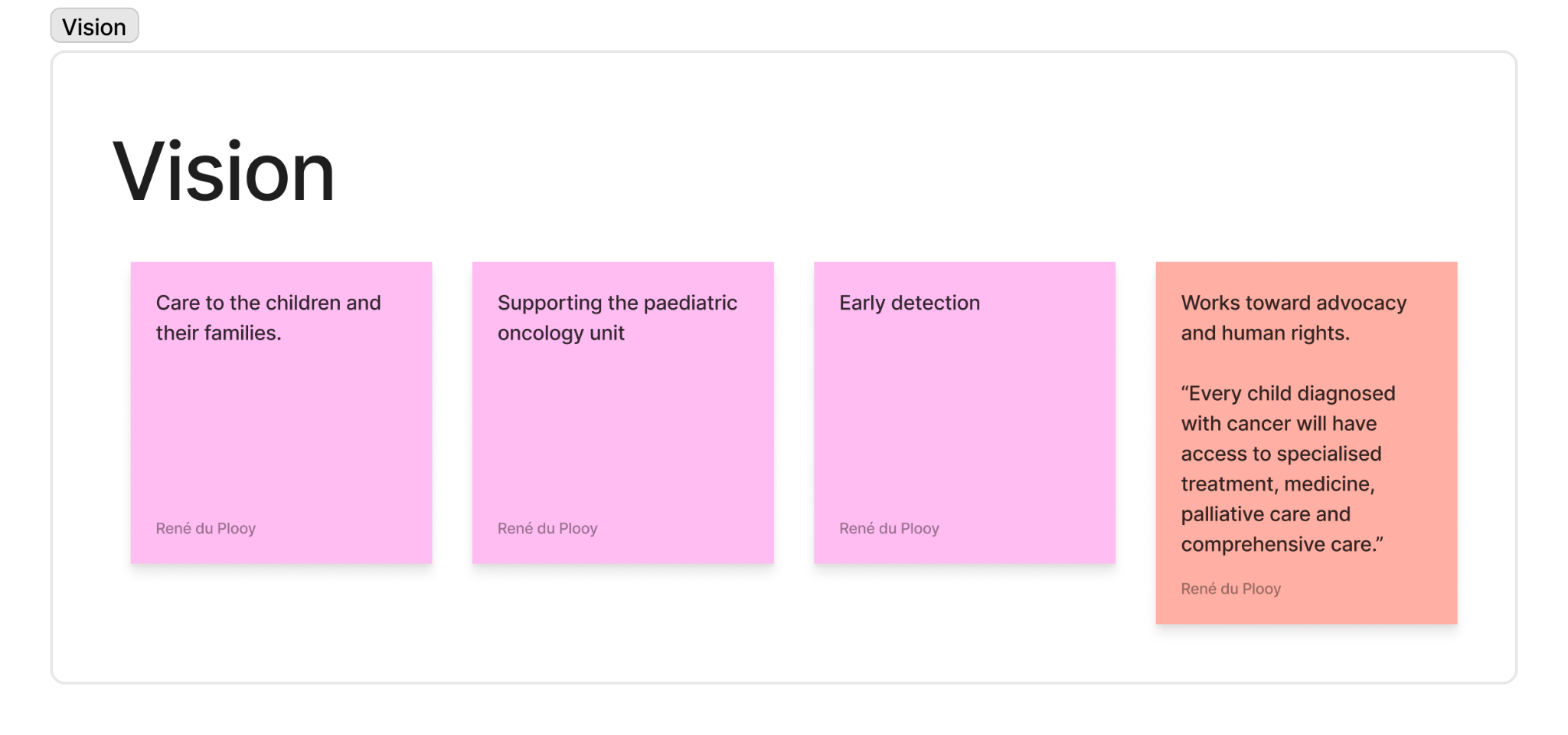
- Raise awareness
- Help more people understand childhood cancer.
- Support early detection
- Make warning signs easier to recognise.
- Support affected people
- Bring useful information closer to families and carers.
Making childhood cancer information clearer and more accessible for families and the people supporting them.
CHOC asked Entelect to help bring its childhood cancer information into a digital format, pro bono. As a non-profit supporting children, teenagers and their families, it could not spare the development budget. My manager said yes without a second thought.
This project is still close to my heart: helping families find information when they need it.
I was the sole designer during CHOC’s early research and concept phase, working with developers, business analysts and CHOC stakeholders. I reviewed the handbook and website, prepared and carried out stakeholder interviews, mapped the content and created personas for the people around a child with cancer.
From there, I shaped the parent-and-caregiver MVP direction and explored the information architecture through low- and mid-fidelity wireframes and an early prototype. I also recreated the rolling hills artwork, developed the app-only logo variation and created Mighty Moo poses with guidance from CHOC’s graphic designer.
At Entelect, I was juggling six projects while on the consultancy bench between client placements. CHOC’s team changed whenever someone was placed with a client, so continuity mattered. When I was placed, I handed my research and early designs over to Laura de Villiers to carry forward.
CHOC gave us a handbook written by a parent who had struggled to find information scattered across different sources. I reviewed it alongside the website, listened to the CHOC team and mapped the information before thinking about screens.
My interview guide covered the project’s scope, existing support, languages, access to care and the emotional needs of children and families. I also asked about privacy, safeguarding and legal requirements. These were questions to investigate, rather than requirements we had already resolved.
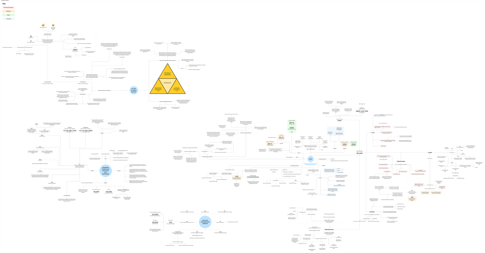
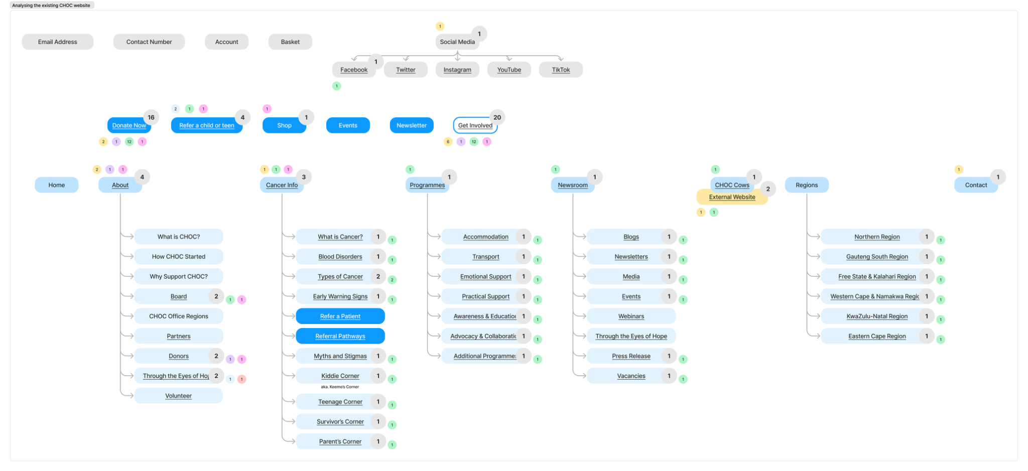
The website was a spaghetti mess of links. I mapped its structure and marked how often the same destinations were linked from each page. Before we could organise information for the app, I needed to untangle what was already there.
The notes showed that printed handbooks, community education and practical support were already part of the picture. A digital tool needed to fit alongside that work.
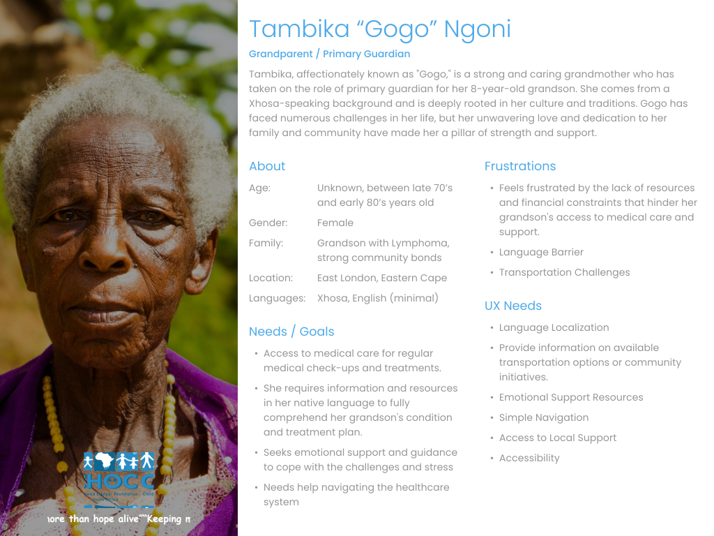
I mapped a whole community around a child with cancer, from family and caregivers to teachers, healers, healthcare workers and volunteers. I also profiled our CHOC stakeholders: Adri Ludick, Alta Bence and Hedley Lewis. The stakeholder names are used with their permission. The names in the other personas are fictional.
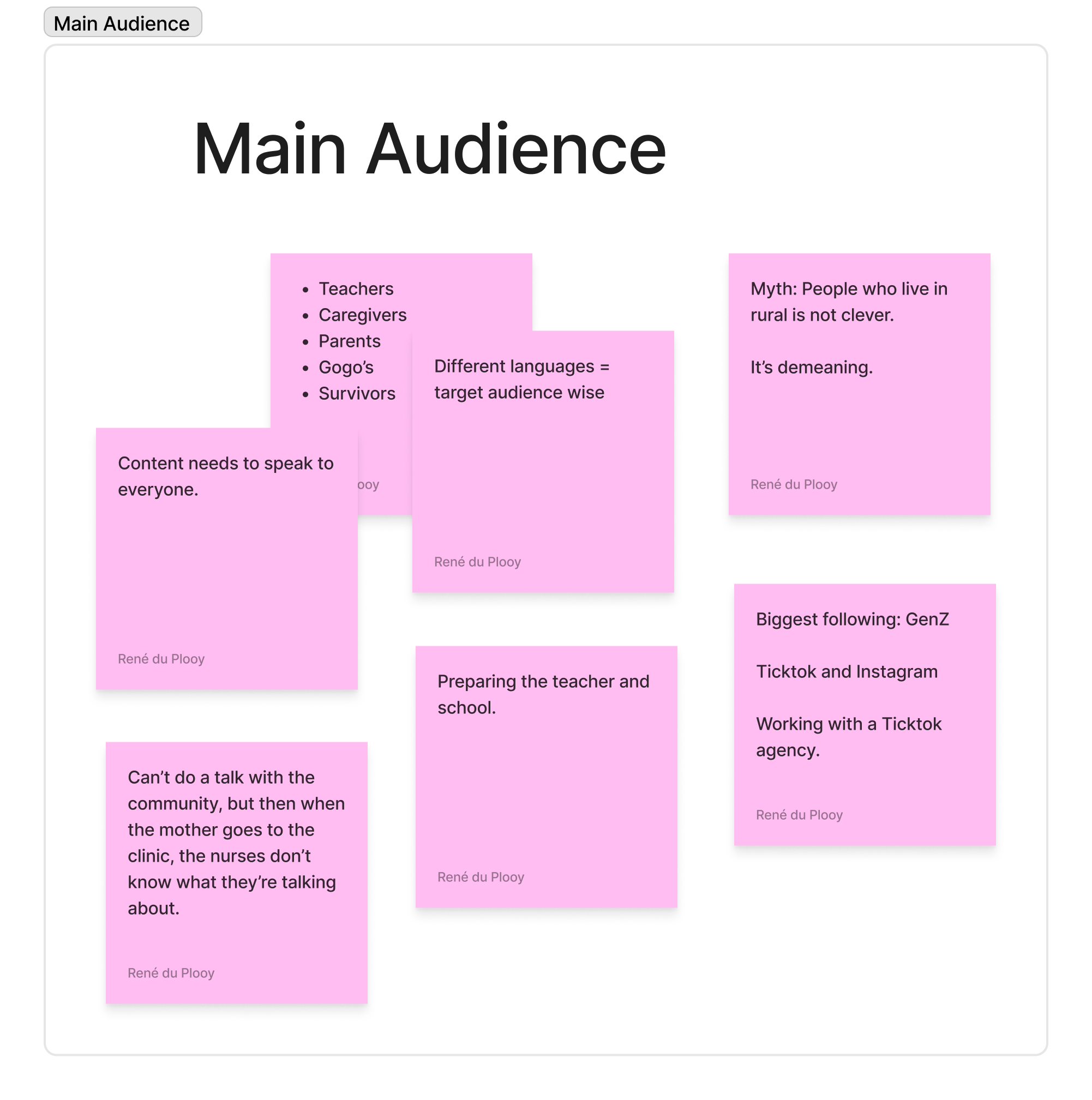
Around 80%
of primary guardians fitted the Gogo persona, according to CHOC stakeholders in our interviews. That insight helped us focus the MVP.
A gogo’s hospital journey was about 15 km, involving walking and a taxi. She could read, but struggled to find her way around apps.
Her children helped with data, while hospital staff and carers provided information. Having data did not automatically make an app easy to use.
A traditional healer might be the first person a parent approached about a worrying lump. CHOC works with healers and community members to recognise warning signs and follow referral pathways.
The design lesson: information needed to reach trusted people, in language they could understand.
CHOC’s awareness programme ↗I looked at a lot of examples before settling on a direction: Ada, Bearable, Becca, Camp Quality’s Kids’ Guide to Cancer, Kena, Symptom checker and WebMD. I wanted to see different ways of making health information approachable.
I also explored LingoKids, LogicLike, MP Weather, Sesame Street and Solar System. For a while, I considered an informational game for children, with a separate area behind a parental gate for the adults.
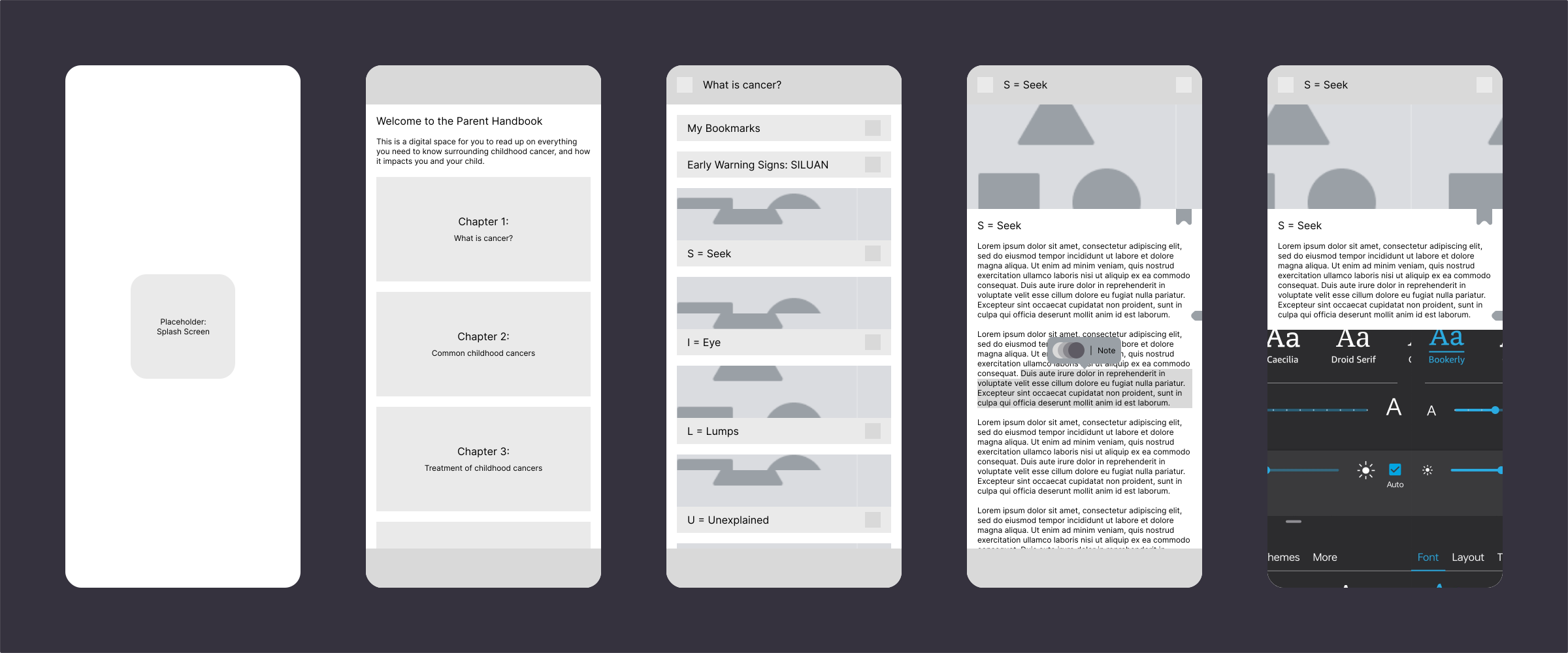
With the access limitations and rotating team already in the picture, I narrowed the MVP direction to one app for parents and caregivers, with Gogo as the primary persona. The children’s game and parental gate were ideas I explored, rather than part of that first scope.
That gave the work a clearer focus: helping the adult caring for a child find the information they needed. It also explains the restrained, adult-facing direction of my early wireframes shown below.
Handbooks and leaflets were already doing important work. Interviews gave us five constraints for an additional digital route.
Explore text-to-speech in home languages, without relying on English or reading confidence.
Download at a CHOC or medical facility, then access the information offline at home.
Keep the download small enough for phones with limited storage.
Investigate reverse billing. This remained an open question, not a delivered feature.
Some people might not own electronics. Printed handbooks and leaflets still mattered. An app could not become the only route to information.
The green field in CHOC’s branding guide was beautiful, but pixelated. I recreated it using simple shapes and kept it in my back pocket.
A good call, as it turned out: it later became part of the rolling hills splash-screen effect.
The smiley face in one logo variation reminded me of the villain’s calling card in The Mentalist. Probably not the association we were going for.
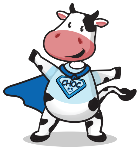
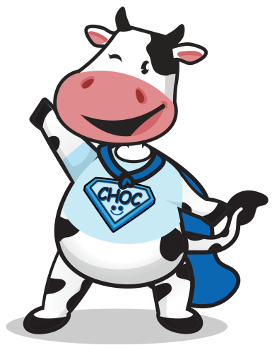
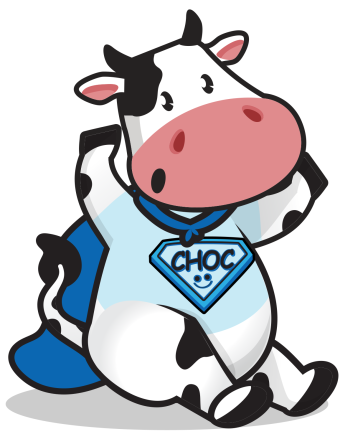
CHOC approved my Mighty Moo variation, as long as it stayed within the app.
Mighty Moo was meant to spread awareness and cheer children up. CHOC told us some children instead understood: cancer happens to the cow, and I am human, so it cannot happen to me.
I wanted him to bring little pieces of information into the journey, as a friendly companion rather than the patient. That also led to his face becoming part of the app logo.
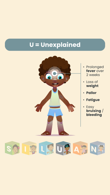
Using building blocks and guidance from CHOC’s in-house graphic designer, I created poses for use throughout the app.
Laura later carried the idea into information snippets, with guidance for their anatomy, spacing and use.
Explore the poses and Laura’s snippets ↗Explore the original discovery notes, interview guide and content mind map. These capture my early work, alongside clearly credited examples of how Laura took the direction forward.
A recording of my original concept, showing the early direction before handover. This is my prototype, rather than the app Laura later took through to delivery.
44 sec · Original concept
I was still in the early research and exploration stages when I was placed with a client and had to leave CHOC. I handed the project over to Laura de Villiers, whose reference you can also read on this site.
Laura went on to research Gogo in more detail, alongside competitor analysis and colour strategy for children and hospital settings. She did a fantastic job bringing the app to life, and I am incredibly proud of what she achieved.
This case study focuses on my initial research, early designs and visual exploration. The examples of Laura’s work are credited to show how she carried that direction forward. Her later research belongs to her.
Laura kept the connection to the original idea, then made it better. These are her final components, and three details I particularly loved.
She worked the rolling hills into the top bar, connecting the intro to the rest of the app.
My idea placed Listen in the top bar. Laura made it a permanent bottom-navigation action, easy to start and stop on every page.
She used CHOC website imagery in the cards and chose a light yellow background that felt like an old book page. I would have reached for white. Her research took it somewhere more considered.
Laura’s care with reading comfort, colour and continuity reminded me to question familiar conventions. I really admired what she brought to the app.
Explore Laura’s component collection ↗The CHOC Childhood Cancer Guide was released on Google Play on 10 September 2025. By 11 October 2026, its public listing showed 50+ downloads.
The published app includes offline access, English and isiZulu content, and audio playback. It is lovely to see those early priorities in the final product, brought through design and delivery by Laura and the wider team.
The download count is a small snapshot of reach, rather than evidence of clinical impact or usability validation.
View the app on Google Play ↗Accessibility became very real here. Would this work for someone who was exhausted, worried, far from help or out of data? That question shaped the content as much as the screens.
Designing for children was outside my comfort zone. I did not know enough about what would capture their attention or keep them engaged, and my early work leaned towards the adult-facing layouts I understood. Looking at children’s apps helped me explore that gap, but it was not a substitute for understanding children themselves.
I did not get to finish CHOC, but the research remains close to my heart. It reinforced the need to recognise where my own experience ends and listen to the people I am designing for.