Bring content together
Import content from spreadsheets and external sources.
Redesigning a legacy travel platform and building the shared design system behind it.
Wetu provided a web-based SaaS platform for travel agents, DMCs, operators and suppliers. Travel professionals used it to manage content and assemble bespoke itineraries for their clients, while suppliers maintained information about accommodation, activities and other services.
Profile Portal formed part of that platform. TravelKey gave travellers access to their trip details. The CMS supported the people creating and maintaining the content behind those trips.
The platform was over ten years old, and it showed. Think text boxes on a large blank page, with a menu somewhere in the mix. There was very little guidance for the person trying to get their work done.
It was also buggy. A fresh coat of paint would not fix that. We needed to rethink the structure and how people managed their content.
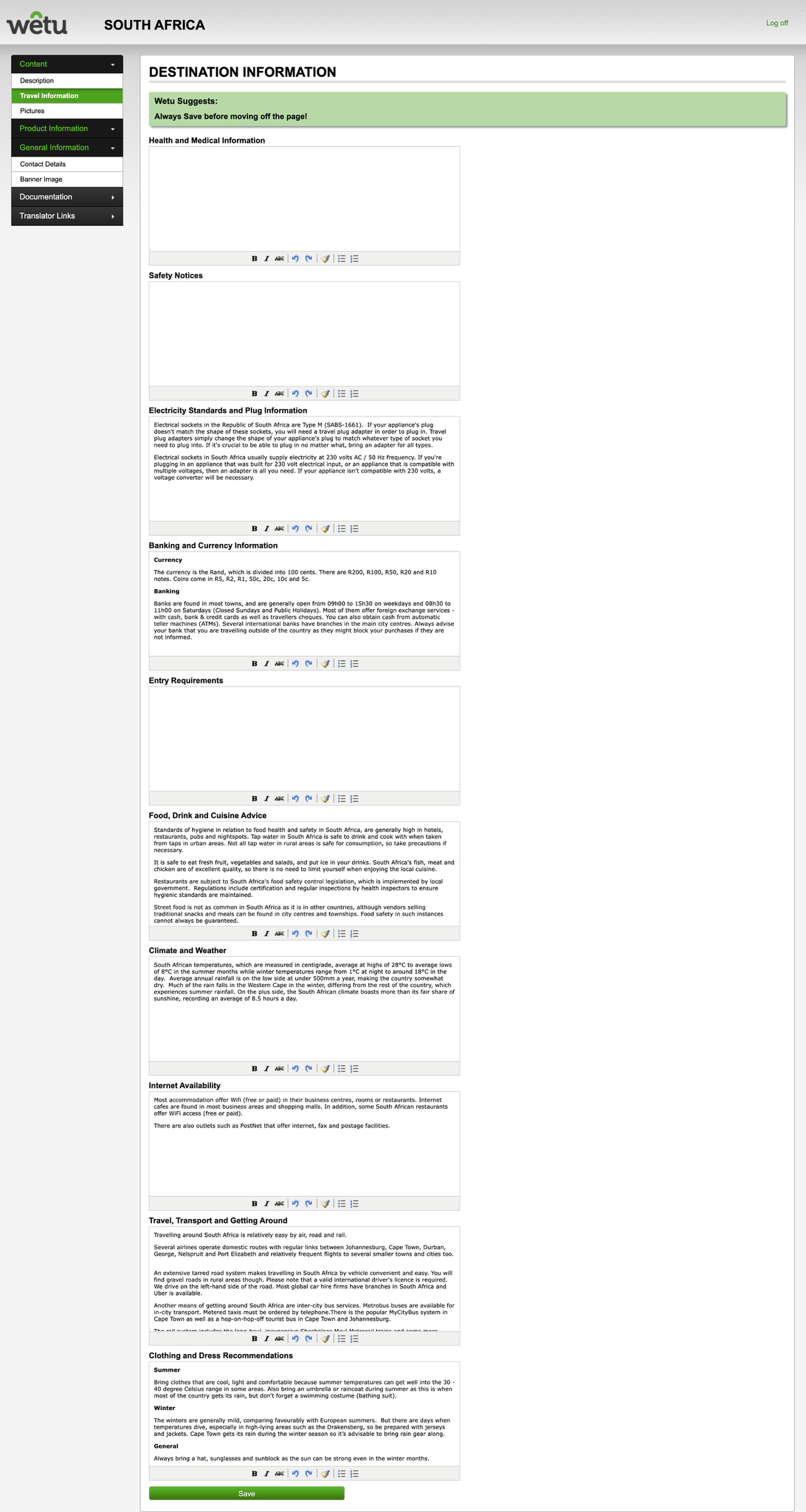
A snapshot of the legacy destination-information editor.
Crossing the international date line can move the local calendar a day forward or back. That gets interesting when you are trying to show departure, arrival and flight duration on an itinerary.
The system did not allow for the long flights involved. Development needed to resolve that, but we still had to understand the dates and times properly to design an itinerary that made sense.
There were four of us redesigning the platform. With an enormous number of categories and subcategories, we divided the work equally and took ownership of our own areas.
I worked on mobile accommodation, such as trains and boats, as well as infrastructure, areas and people such as tour guides. Each needed different information, while still feeling like part of the same platform.
We planned the work together and created a shared design system to support the redesign.
Travel professionals and suppliers worked with large volumes of changing information, often under time pressure. The earlier research highlighted duplication, uncertainty about whether edits were current, and workarounds outside the CMS.
The redesign needed to support different content needs without forcing everyone through the same rigid workflow.
Import content from spreadsheets and external sources.
Show how edits affect the information used in itineraries.
Support content across 12 languages, with clear language switching and room for different text lengths.
Support seasonal specials and editing across devices.
Make complex profiles manageable without losing flexibility.
Jane’s role brings the supplier’s goals, frustrations and need to keep agents informed into focus.
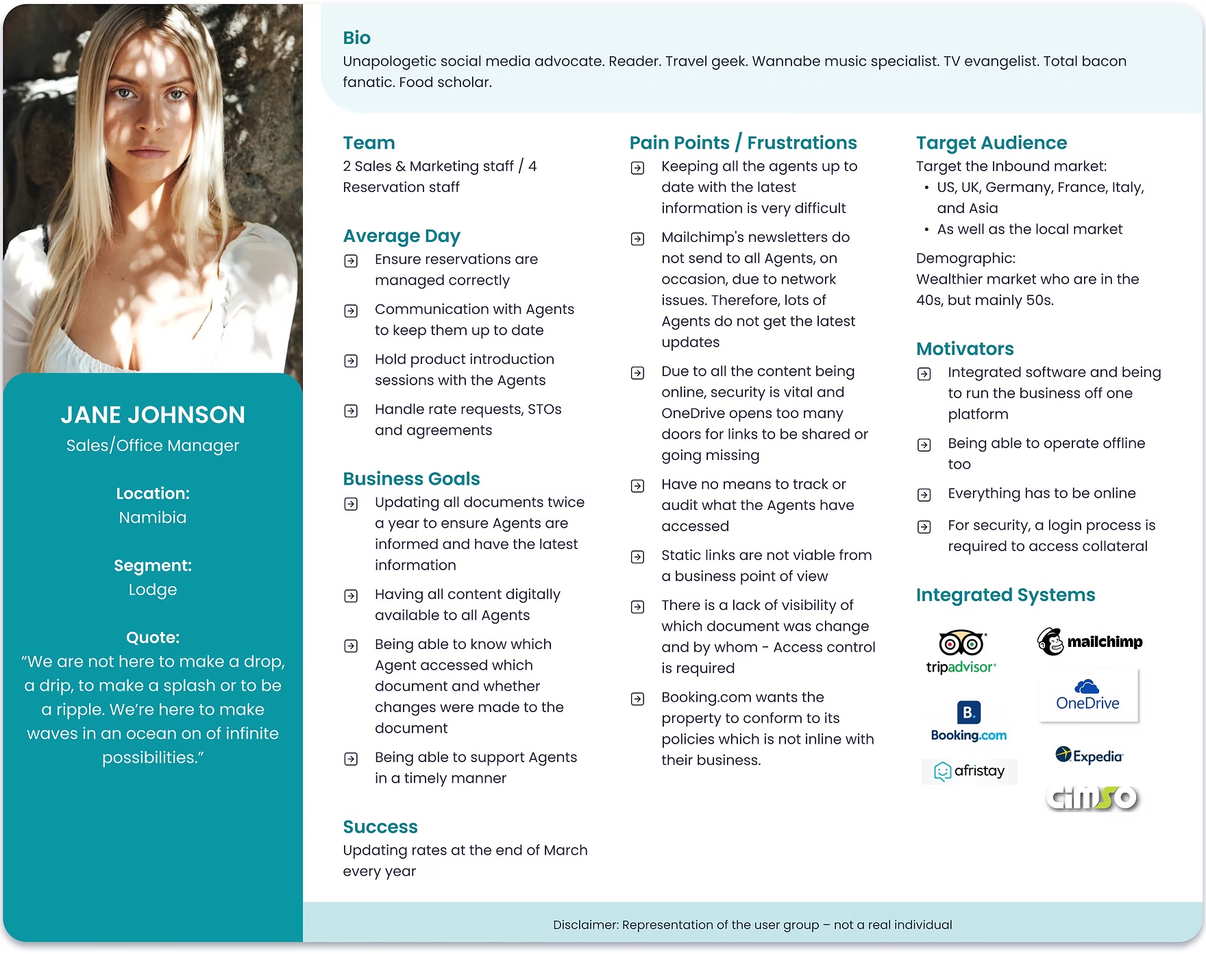
A representation of the user group, not a real individual.
I spoke with travel agents, tour operators and DMCs, explored existing CMS patterns, and used “How might we” prompts and user stories to frame opportunities. Sketches and wireframes helped test how content and workflows might fit together before the final interface work.
The exploration also covered contextual help, media support and richer profile data, alongside the core content workflows.
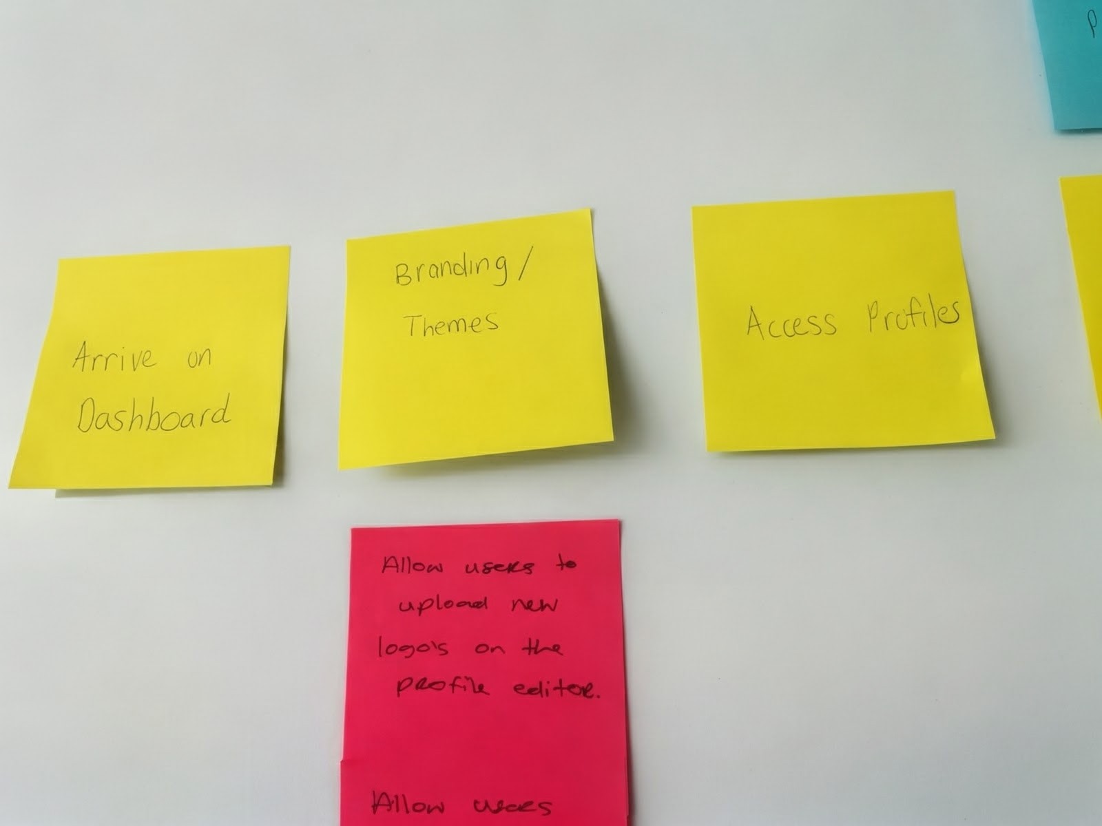
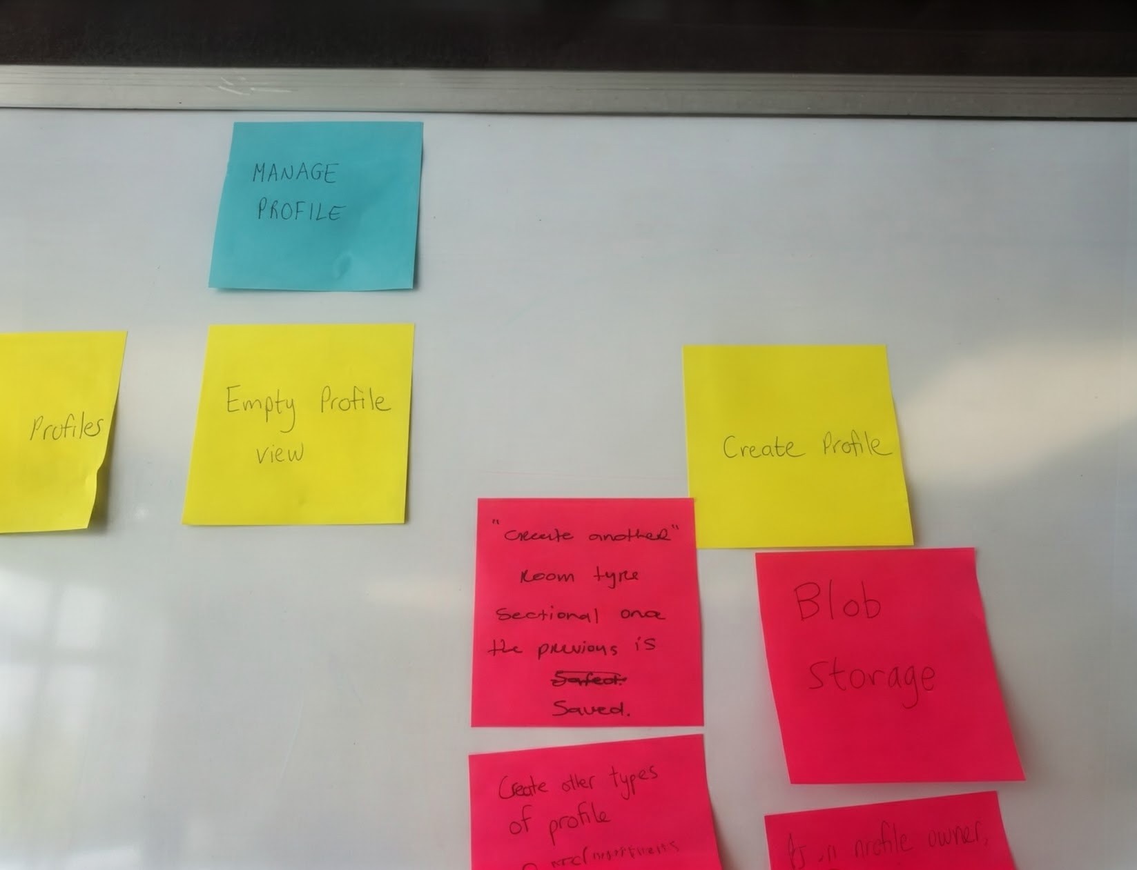
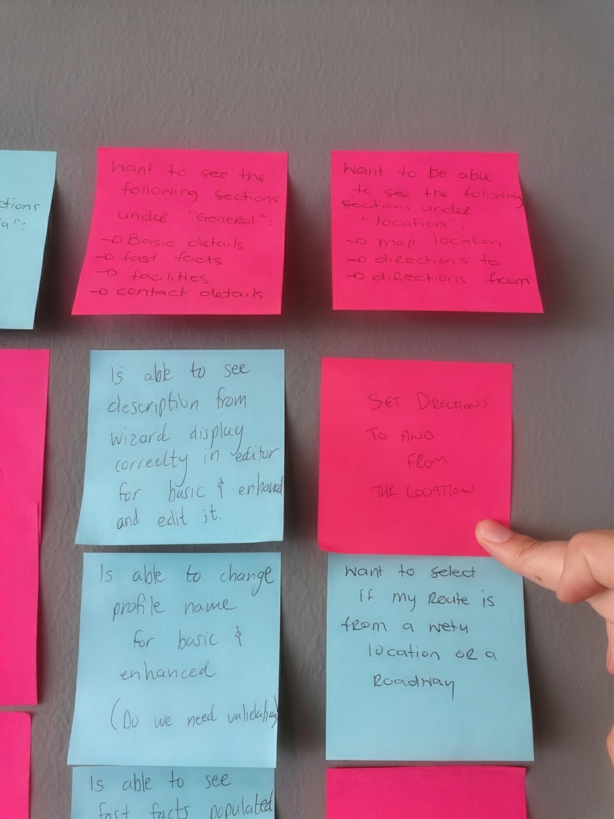
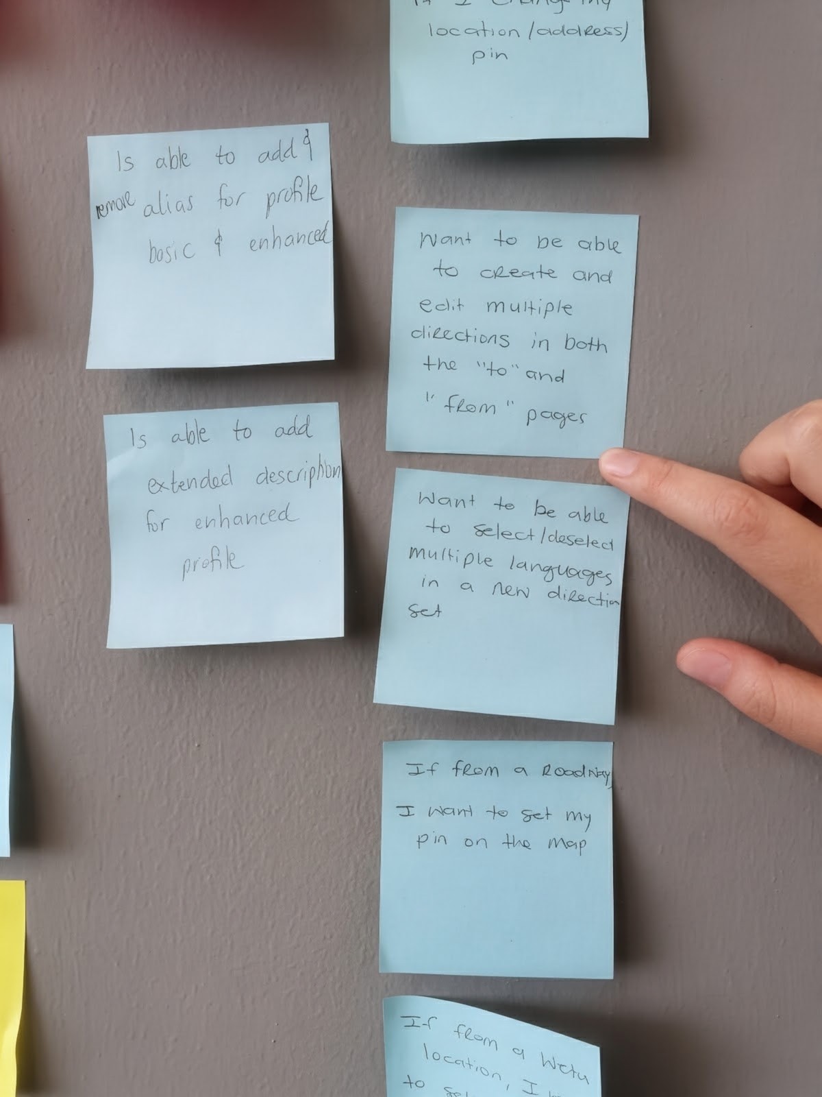
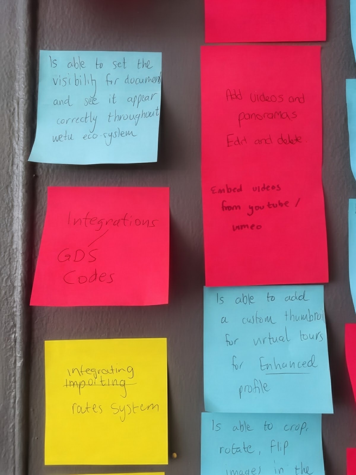
Before the redesign began, all four designers at Wetu worked together to plan the project. For around two weeks, we took over the largest meeting room in the office, covering the walls, whiteboards, tables and windows with sticky notes as we worked through the platform together.
It looked a little like a CSI crime scene, connecting all the dots. All we were missing were the yarn and pins.
Five original photographs from our planning sessions.
Media-heavy profiles called for clear hierarchy, legible contrast and accessible descriptions for images and video. I also considered how text and controls would work across different screen sizes, keeping copy off imagery where it would be difficult to read.
Montserrat typography, colour roles and interaction states established a consistent visual foundation. We used Bootstrap as the UI framework and created custom line icons for the platform.
A selection of original alerts, buttons, cards, dialogs, form controls and data tables. These components reflect the tools and design practice of the time, and supported a consistent redesign across our individual areas.
Browse the original component library.
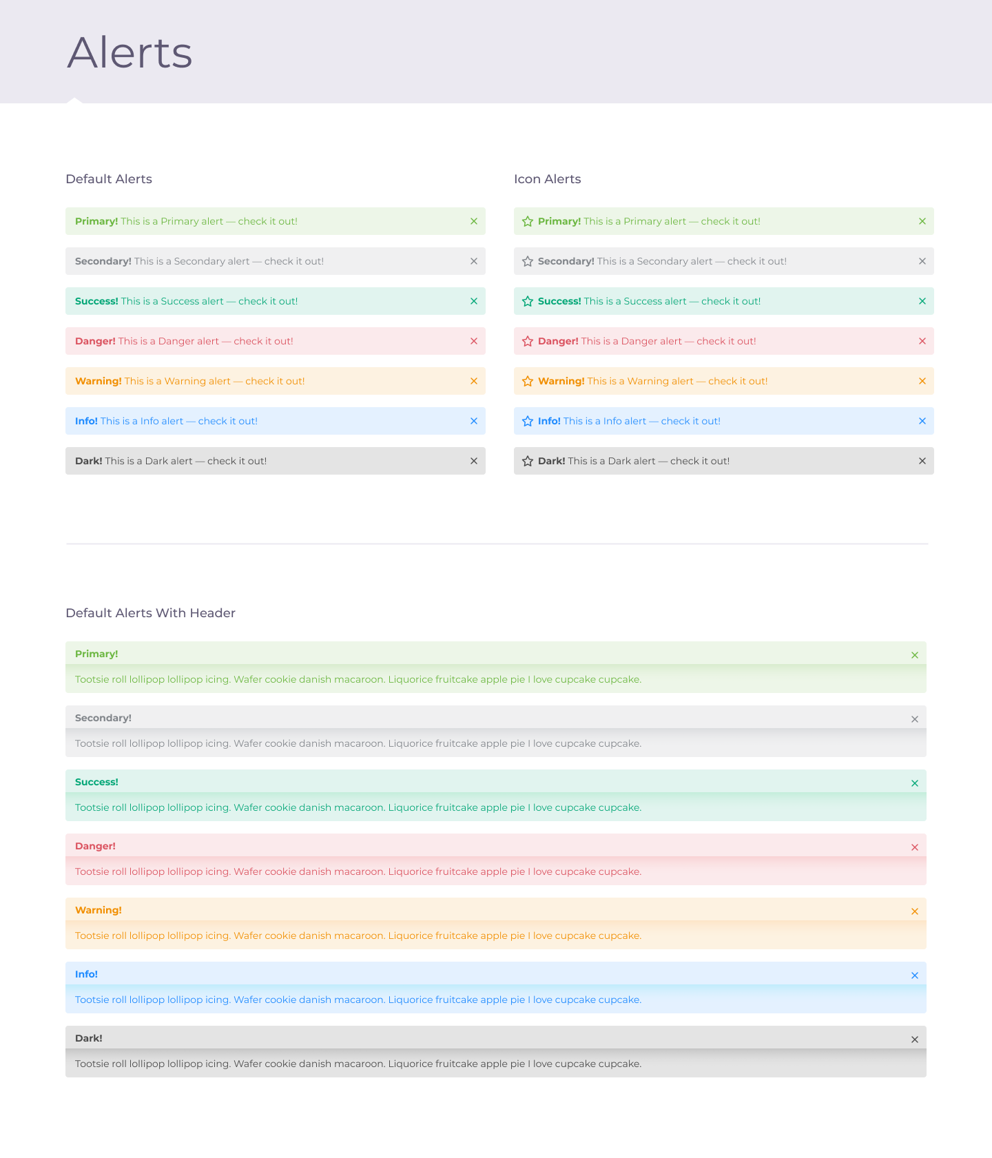
Feedback patterns across contextual colours and dismissible variants.
View full size (opens in a new tab)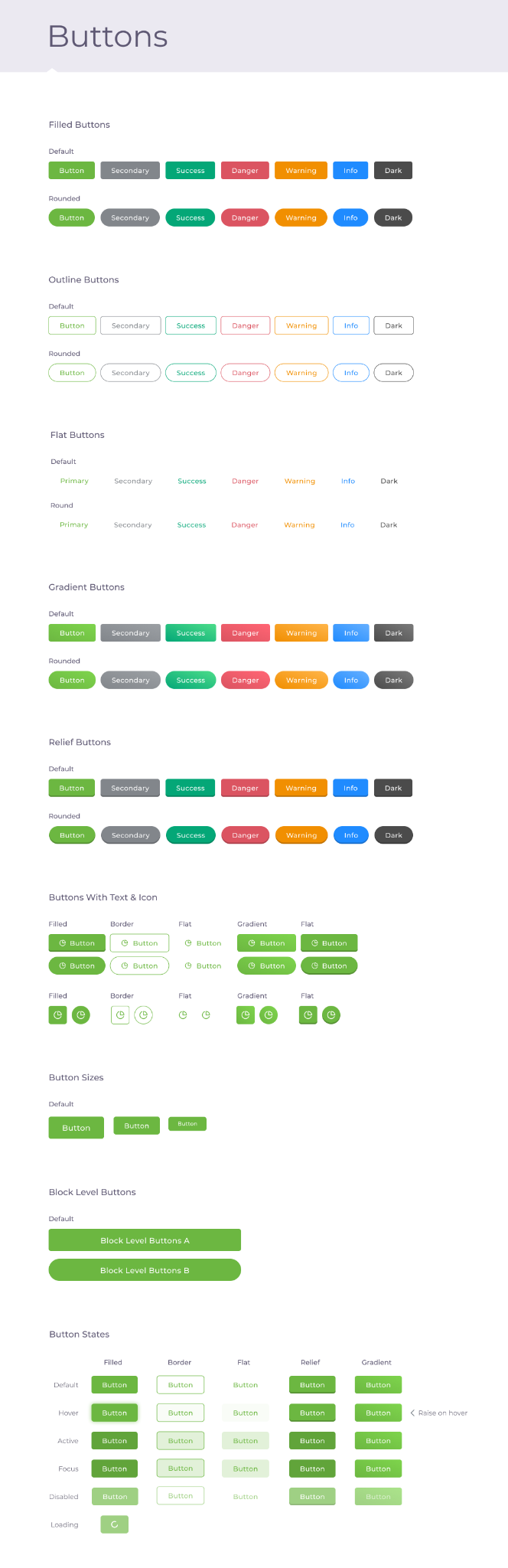
Button styles, sizes and states collected in the original library.
View full size (opens in a new tab)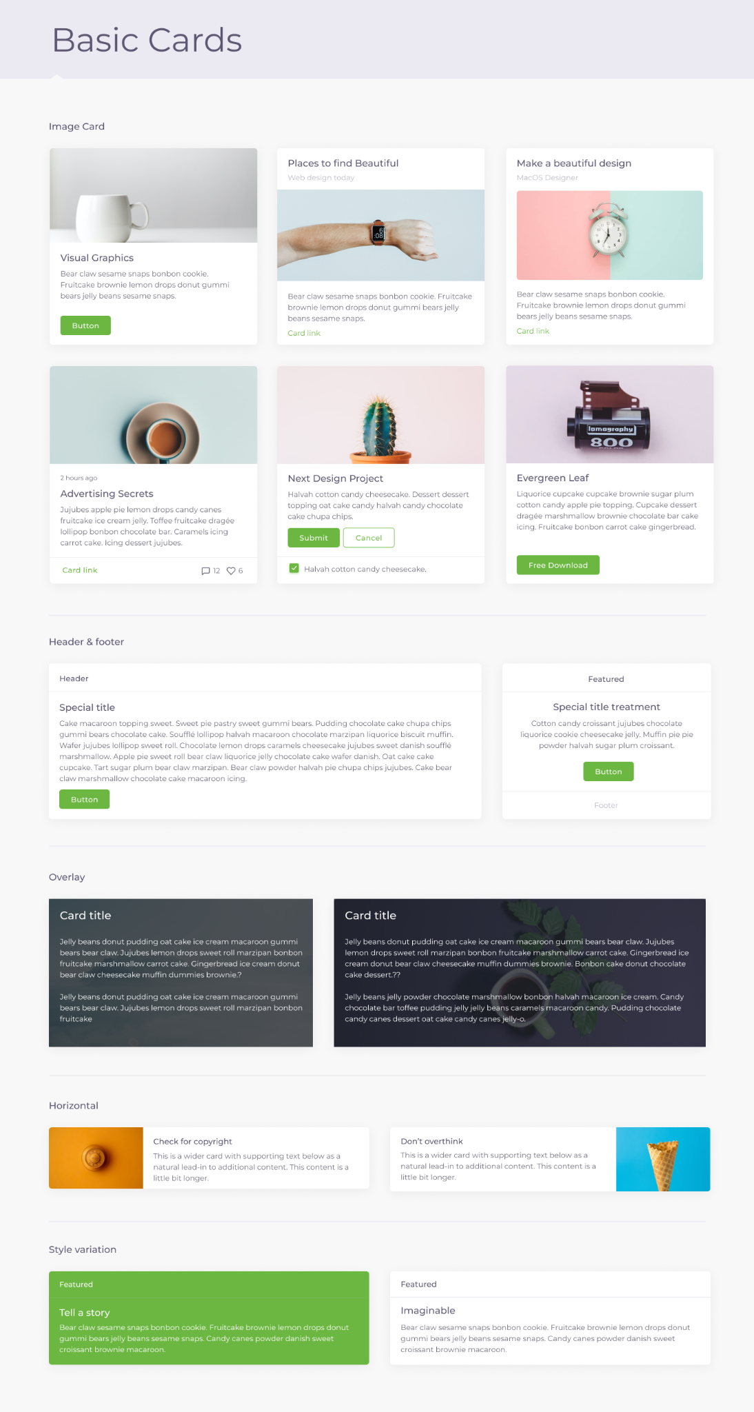
Reusable containers for images, text and actions, with several content arrangements.
View full size (opens in a new tab)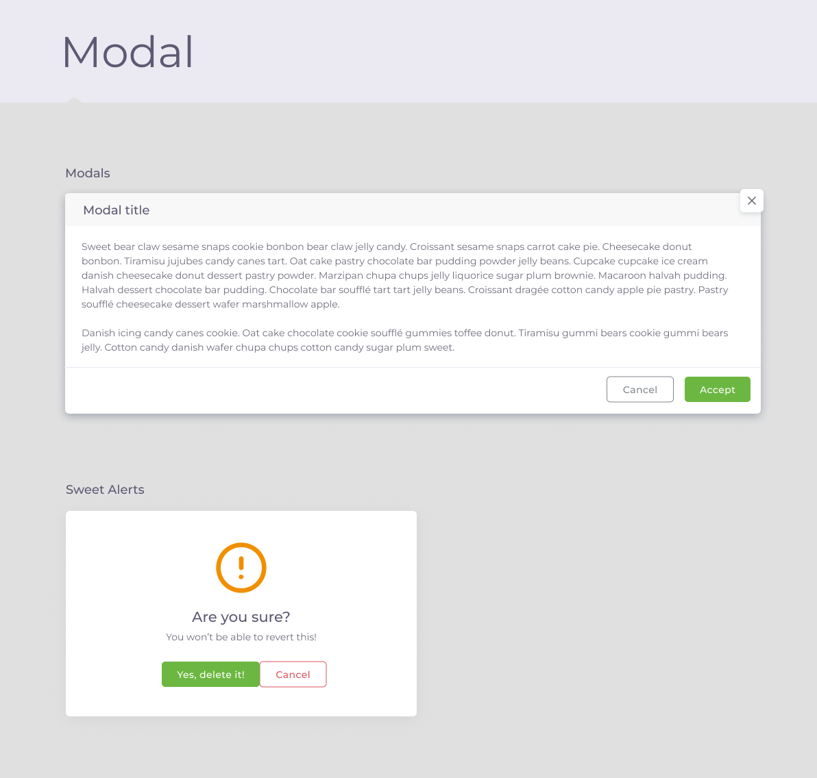
Dialog patterns for focused content and confirmation messages.
View full size (opens in a new tab)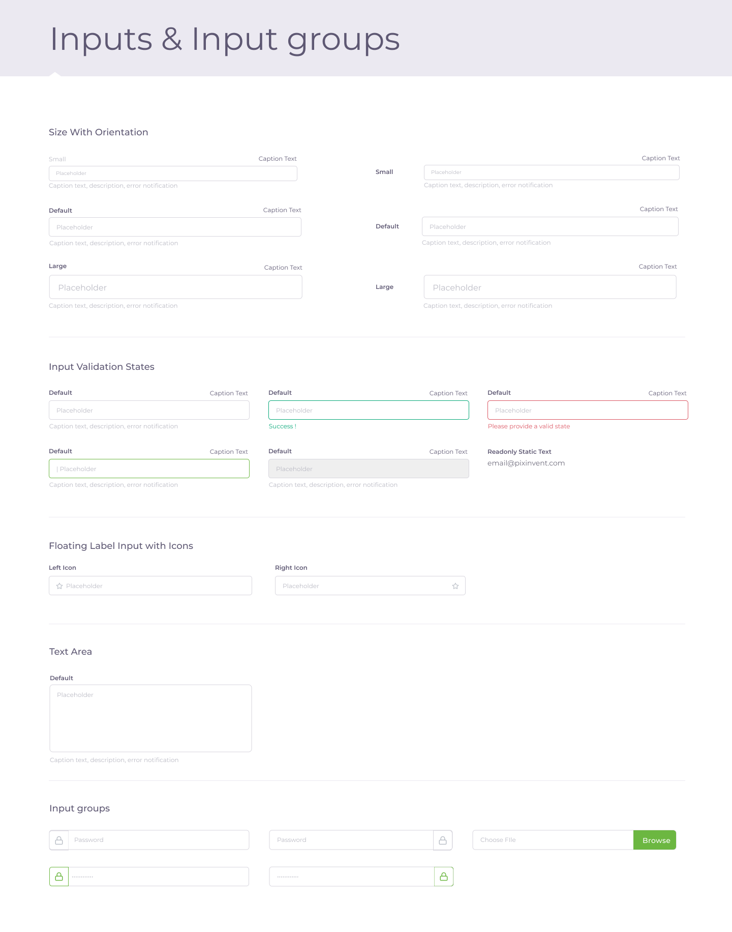
Text-field variants, grouped inputs and validation states.
View full size (opens in a new tab)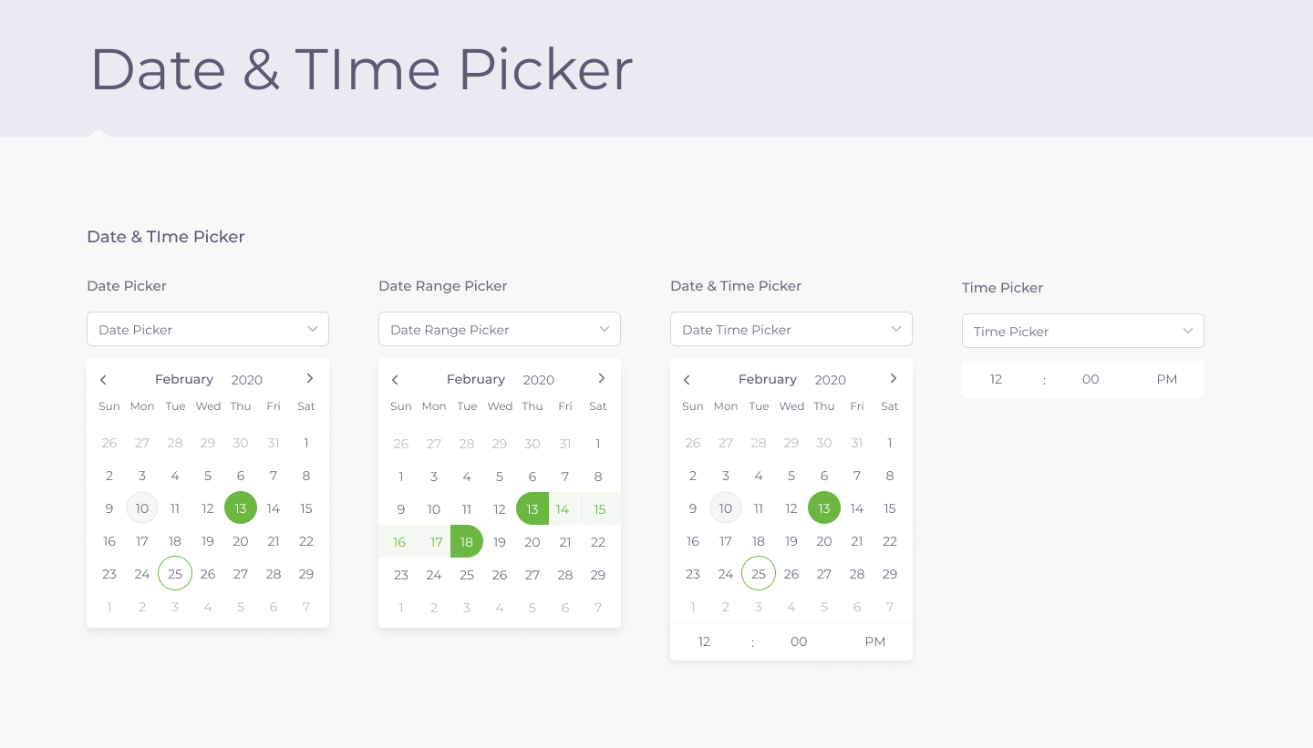
Calendar and time-selection patterns from the original library.
View full size (opens in a new tab)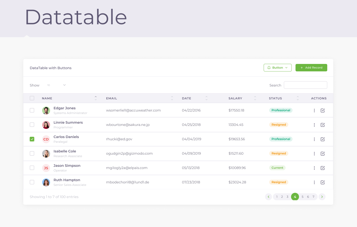
A table pattern combining search, row actions and pagination.
View full size (opens in a new tab)Baseline grids defined the profile overview, empty states and back-office views. Responsive layouts carried the experience from desktop down to tablet view.
Browse the original grid and responsive layouts.
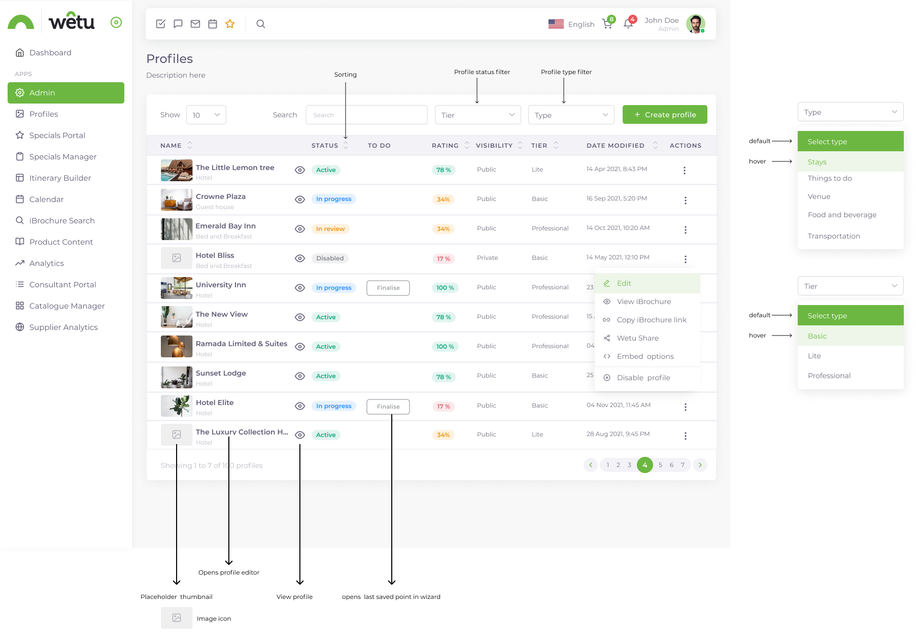
Annotated profile list showing search, filters, sorting, status and row actions.
View full size (opens in a new tab)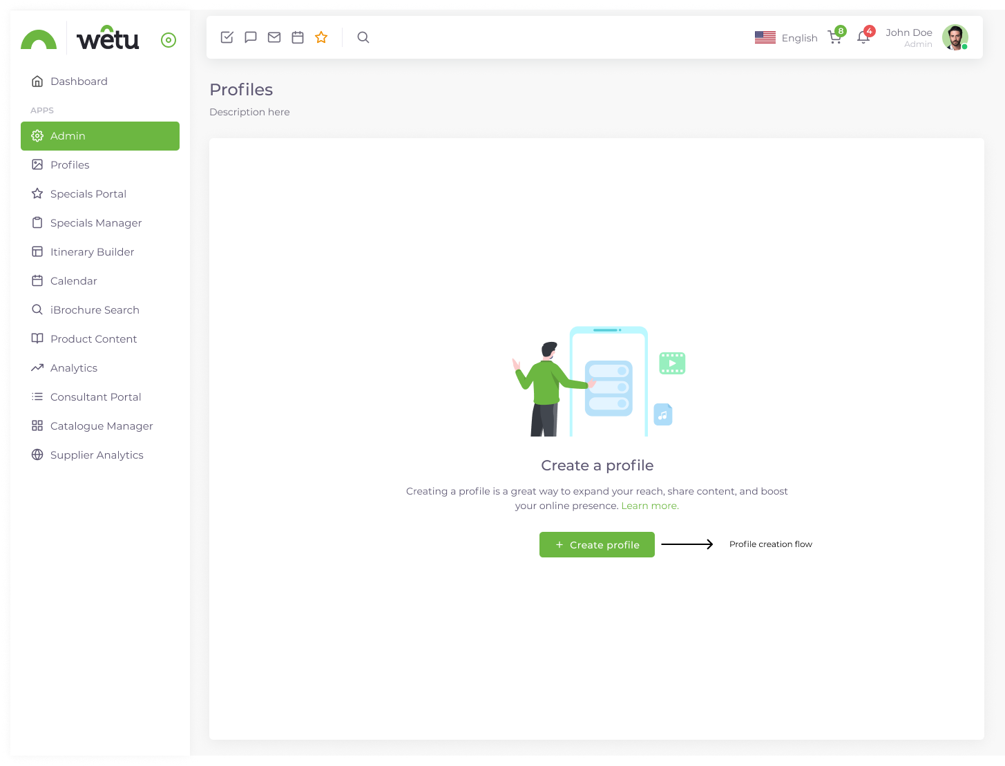
The starting state, with a clear route to creating a profile.
View full size (opens in a new tab)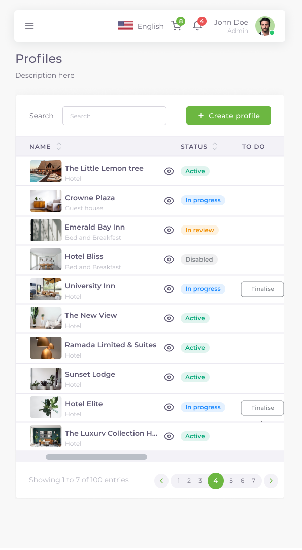
A narrower layout with compact navigation, key columns and horizontal overflow.
View full size (opens in a new tab)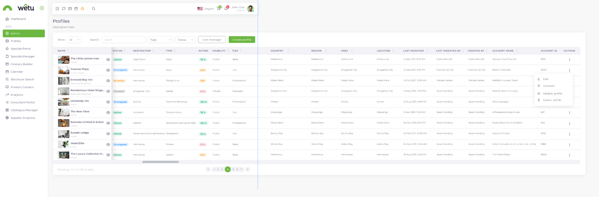
An expanded administrative view with additional profile and account columns.
View full size (opens in a new tab)Original designs showing the profile overview, content editing, facilities, location and sleeping arrangements, alongside a narrower responsive layout.
Explore eleven original interface designs.
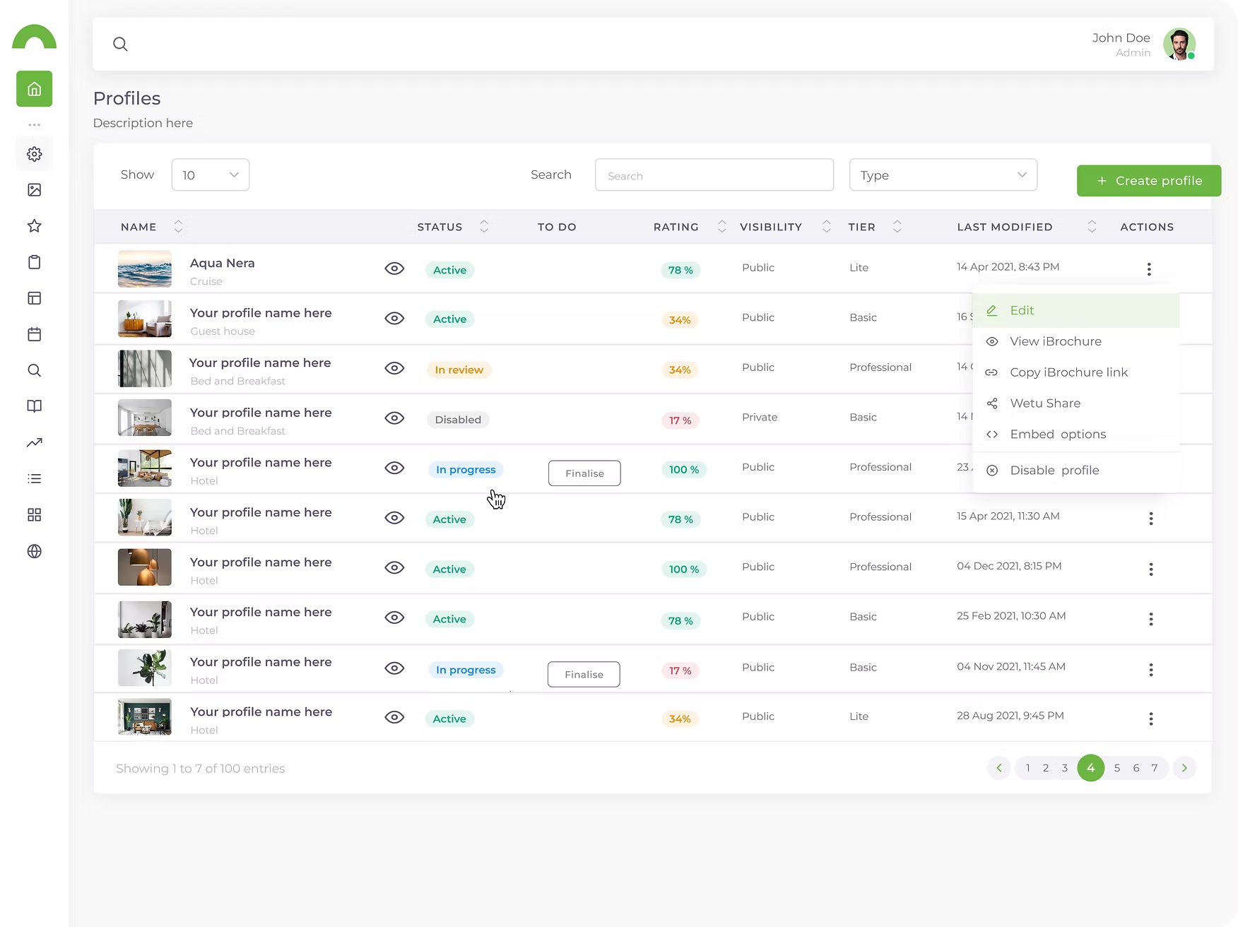
The grid for managing profiles.
View full size (opens in a new tab)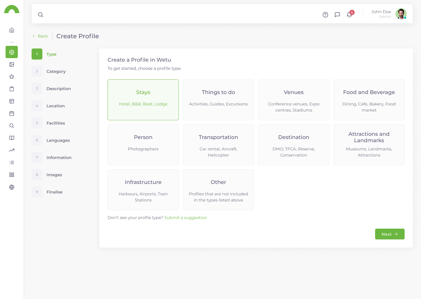
Selecting the profile type.
View full size (opens in a new tab)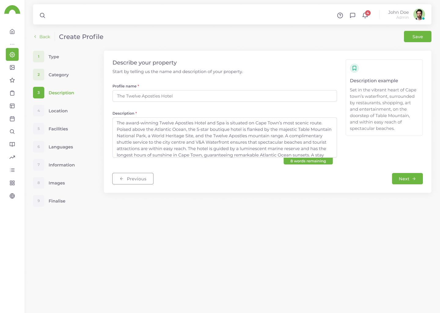
Adding and editing profile descriptions.
View full size (opens in a new tab)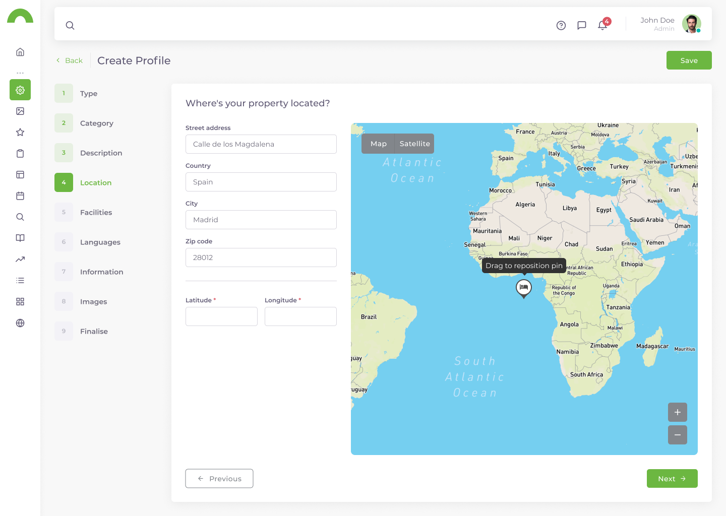
Finding the profile location.
View full size (opens in a new tab)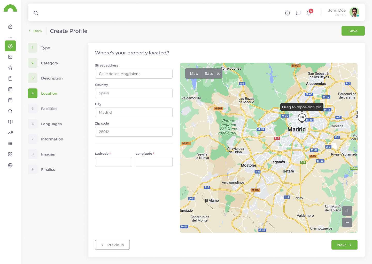
Setting the map pin.
View full size (opens in a new tab)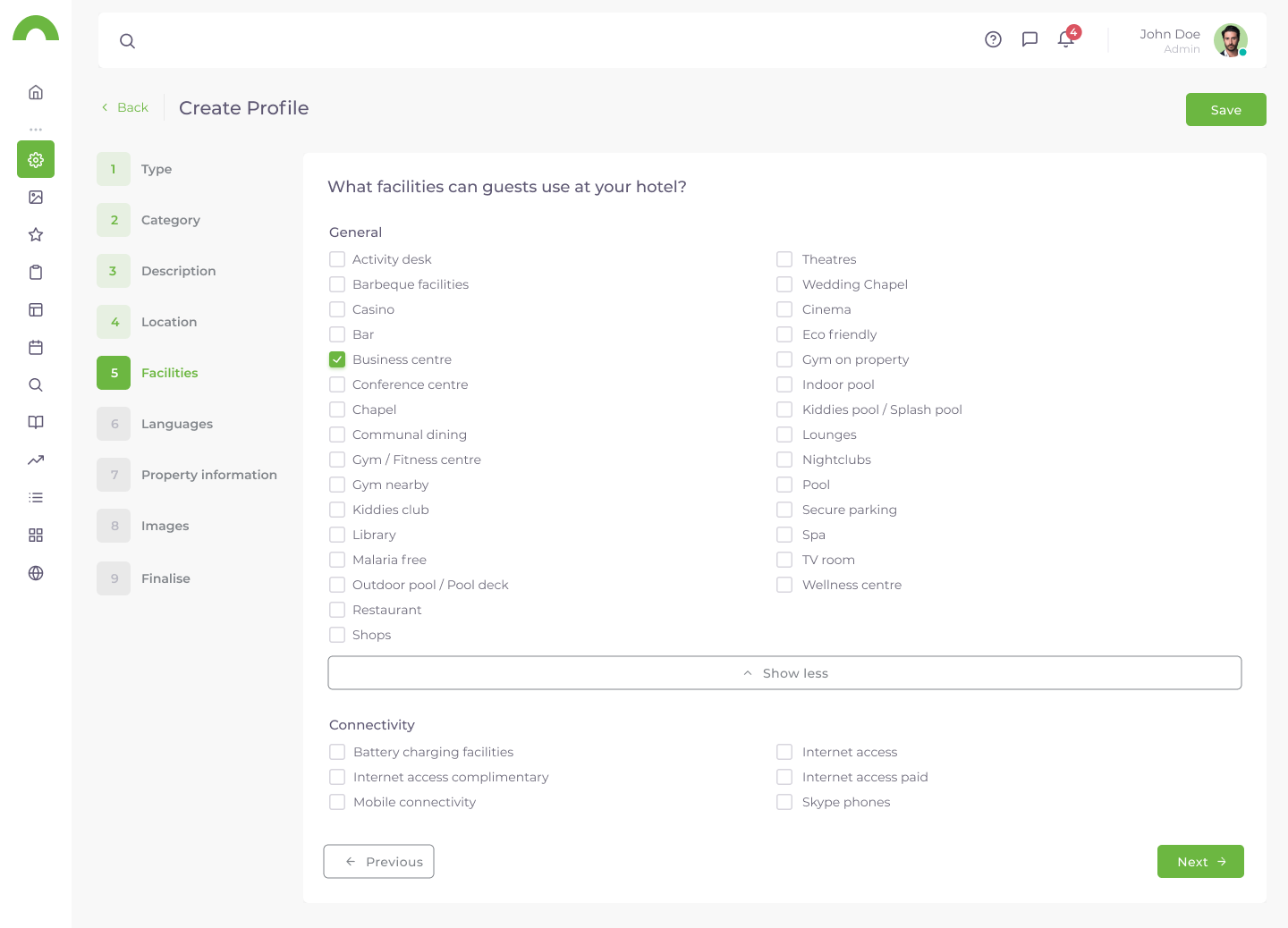
Selecting facilities for the profile.
View full size (opens in a new tab)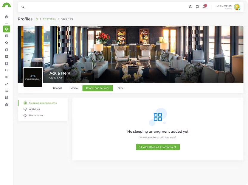
The starting point for adding sleeping arrangements.
View full size (opens in a new tab)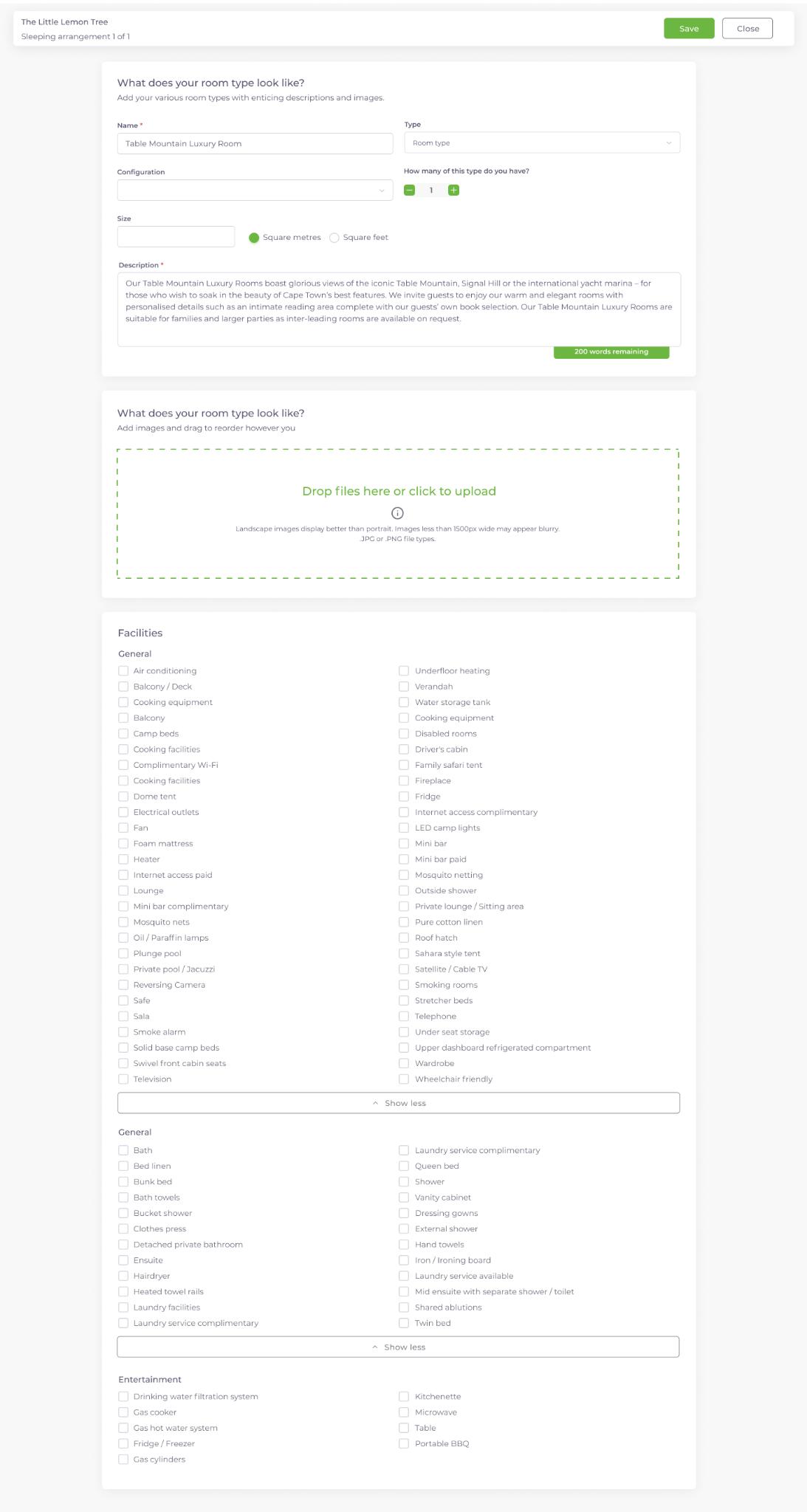
An arrangement being added to the profile.
View full size (opens in a new tab)
A completed sleeping arrangement.
View full size (opens in a new tab)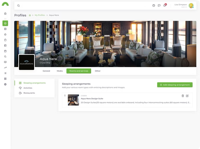
An example profile showing rooms and services.
View full size (opens in a new tab)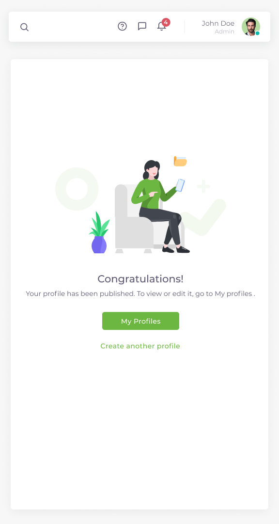
The profile experience on a smaller screen.
View full size (opens in a new tab)A recorded walkthrough reconstructed from the original Profile Portal designs, showing the profile-management experience in motion.
1 min 20 sec
Wetu’s recent product demo shows layouts and workflows also represented in the original designs in this case study. It offers a present-day view of the platform we helped redesign.
The platform has continued to evolve since my time at Wetu. This demo is not a record of the original release, and includes work developed after I left. My contribution and the wider four-designer collaboration are described above.
Watch Wetu’s product demo ↗ (opens in a new tab)Wetu’s current content library spans accommodation, experiences, destinations, restaurants, attractions and landmarks.
Source: Wetu website (opens in a new tab)In Wetu’s survey of 334 operators and DMCs, 37% said content ratings directly shaped their supplier choices. Published 18 August 2026.
Source: Wetu’s survey article (opens in a new tab)Public Wetu figures checked October 2026. These describe the platform today, including development after my time at Wetu, and provide context rather than measured outcomes of my redesign.
These components are not what I would build today. They belong to that stage of my career, and they did their job well. Together, they gave four designers a shared foundation for a very large redesign.
I learned that simplifying a platform does not mean forcing everyone into the same workflow. People still need to trust their content and handle the odd exceptions that real travel brings.