Dinner with a friend
You pay the whole bill, then request your friend’s half.
Making it easier to ask for money back, and clear what happens when someone asks you to pay.
Request to Pay kicked off in February 2024, with a deadline set across the South African banking industry. It runs on PayShap rails. My part was designing the Capitec app experience.
Think “please pay me”, but through your banking app. The person receiving the request decides whether to pay or decline. If they approve it, the money moves in real time.
This was for you and me. Dinner with a friend, tickets for the group, or the office coffee run. The everyday “I’ll pay you back later”.
You pay the whole bill, then request your friend’s half.
Daniel buys discounted tickets for the group, then requests each friend’s share.
Janice buys a coffee for Mark while he is stuck in meetings. He can pay her back when he has a moment.
My job was to make those moments easy, without any confusion about whether you were asking for money or agreeing to pay.
There were very few local examples to learn from. I looked at international apps, including Tikkie in the Netherlands, then worked out what would make sense for our clients and banking requirements.
Behind the scenes, there was a lot to untangle. On screen, people needed four things: who is asking, how much, when it expires and what happens if they agree.
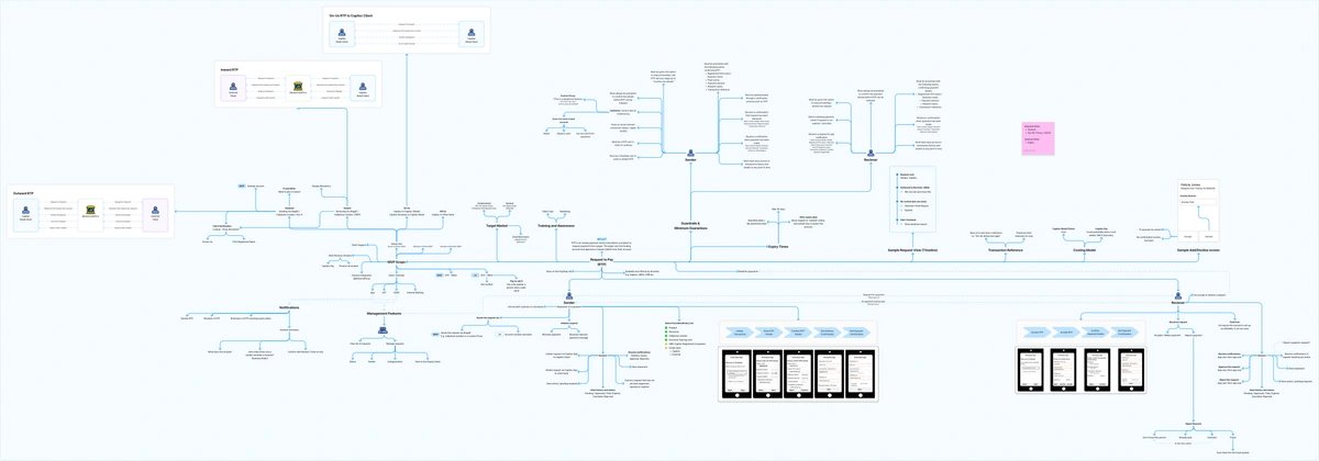
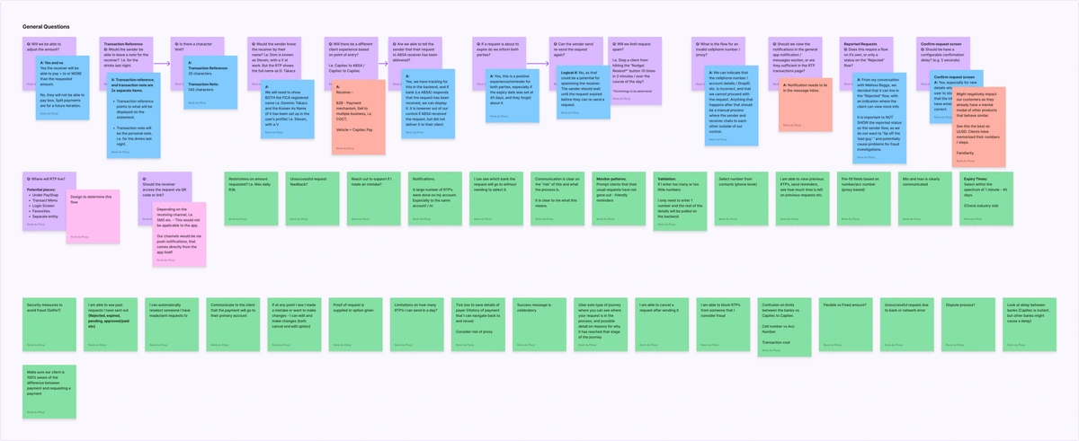
Before drawing screens, I mapped both sides of the request and worked through the questions with the team. Who can receive one? What happens if details are wrong? What does each person need to know?
A familiar nickname might be enough in a conversation with a friend. In a banking app, I needed to give people more to go on before they agreed to pay.
My research established that registered identity details mattered alongside the bank and recipient information. I carried that into the request and review screens, giving people the details they needed to check who they were dealing with before confirming.
The aim was to make that decision clearer, especially when a name looked unfamiliar, and give people a chance to check the details before money moved.
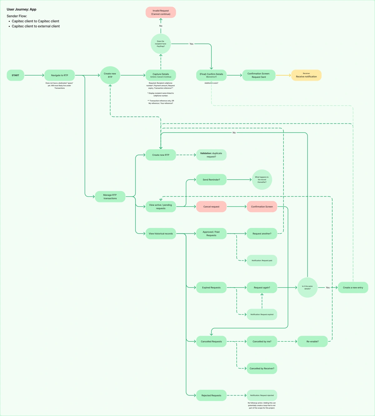
Review details before sending, correct mistakes, understand rejection or cancellation, and distinguish an expired request from a paid one.
Make sent and received requests easy to find, identify important notifications and communicate what happens next.
I also worked through unfamiliar requesters, reporting, reminders and bank differences. These were design considerations. Not every option shown in the early work was confirmed for delivery.
Sending a request meant more than entering an amount. I worked through recipient checks, confirmation and tracking, as well as reminders, duplicates and cancellation.
Receiving one needed its own flow: notification, review, payment, decline and reporting. Scheduling, partial payment and reopening were early questions, not confirmed features.
Explore sender and receiver maps ↗I was the sole designer on Request to Pay, working closely with Riefad Davids, the payments product manager at the time. He made sure I had the information I needed, and we built a strong working relationship as we worked through the project.
I owned the UX flow and app screens for sending and responding to requests, including the decisions, statuses and exceptions between the happy paths.
Here is the work behind the screens, from the first questions to the detailed designs. Open a collection to explore it at your own pace.
Original project artefacts may refer to me by my maiden name, René du Plooy.
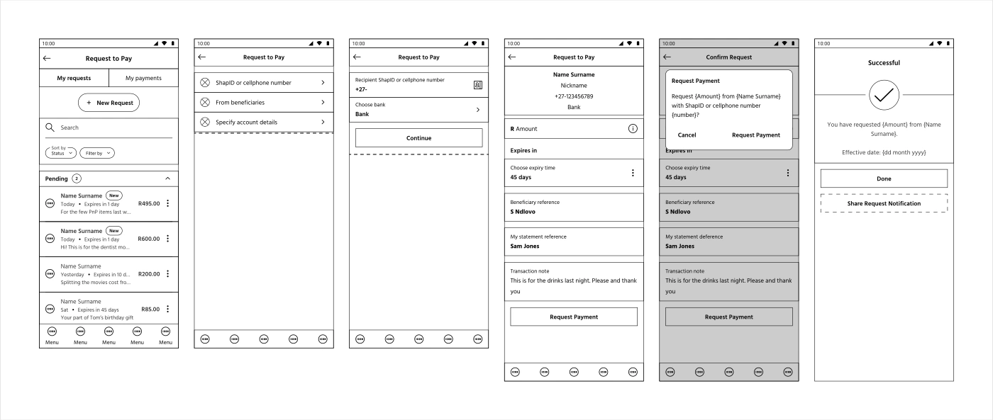
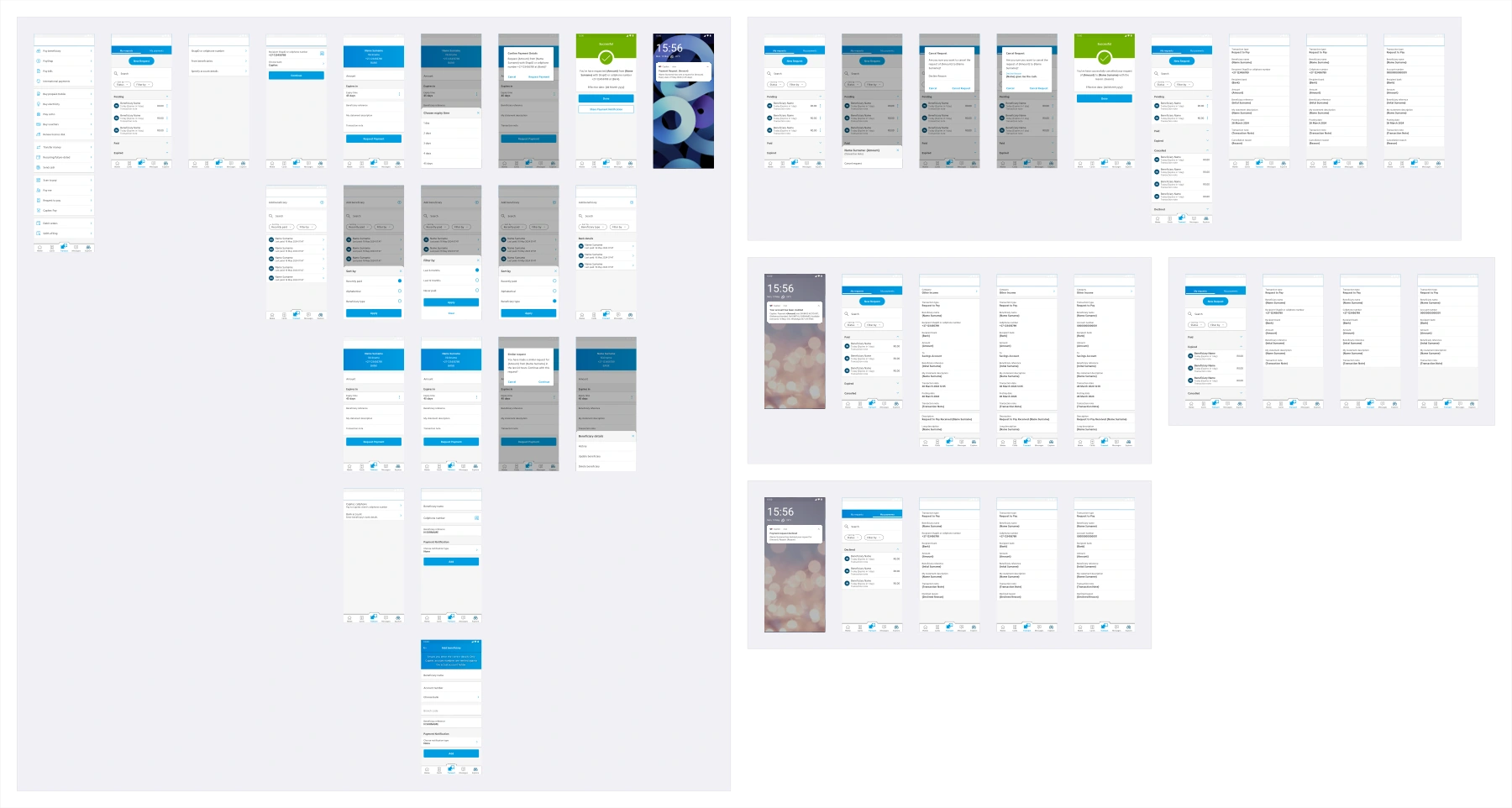
The project was handed to another designer shortly before completion. The flows and screens shown here document my design work before that handover. PayShap Request has since launched, with further changes made after my involvement.
As of October 2026, Capitec’s public product page confirms the service is available in the app. It lists a R100 limit per transaction and up to two transactions every 24 hours, with a combined value of R200. These are the live product limits, rather than the scope of my original designs.
I worked hard on this project, and I was incredibly proud of what I produced. At a team townhall, the head of app asked me to stand up and thanked me for the work. That recognition meant a lot.
The following day, the project was reassigned with my design work close to completion. Losing ownership at that point was difficult. I cared about the experience and wanted to see it through to production. The released product evolved after my handover, so this case study shows the flows, decisions and designs I owned.
It reinforced the importance of documenting the reasoning behind a design, alongside the screens themselves. A handover needs to explain why a question is asked, what an extra step costs someone, and which decisions keep the journey straightforward. Those details matter when another designer takes the work forward.