Find the essentials
Clearer routes to daily plans, documents, contacts and location information.
Bringing two separate mobile apps into one consistent experience, with essential trip details available offline.
Wetu provided the platform travel professionals used to create itineraries, alongside the content maintained by suppliers. TravelKey was the app travellers used to access the trip those professionals had prepared.
The app brought together dates, transport, accommodation, activities, vouchers, maps and emergency contacts. Travellers needed to find those details quickly while away from home, often with limited connectivity.
The iOS and Android apps had separate codebases and component libraries. Each followed its native platform, leaving two versions of the same product with different layouts and behaviour. The apps also had a range of bugs and limitations tied to the legacy code. The weather, for example, was available on iOS, but the Android implementation was unreliable and had been removed.
Travellers could be checking a transfer time, finding a voucher or contacting someone in an unfamiliar place. Information needed to be easy to find and readable at a glance, with essential content available offline.
TravelKey was my project as an intermediate designer at Wetu. My senior trusted me to explore and make decisions, with plenty of room to learn. We worked through it together, with her supporting and guiding rather than taking over.
That trust made a difference. I could own the work, ask questions and build the judgement I now use as a senior designer.
We redesigned the experience and rebuilt the app in Flutter. The developers were learning Flutter as we went, so I needed to understand its patterns and work with what the team could build.
I researched the framework, mapped the traveller journeys and used sketches and wireframes to work out the content structure. From there, I built the shared layouts and components.
Clearer routes to daily plans, documents, contacts and location information.
Make downloaded trip information and offline states understandable.
Use legible type, strong contrast, plain language and visible navigation instead of relying on hidden gestures.
Consider multiple itineraries, dark mode and client theming within the shared system.
Marieke’s safari trip brings the traveller’s goals, concerns and need for reliable information into focus.
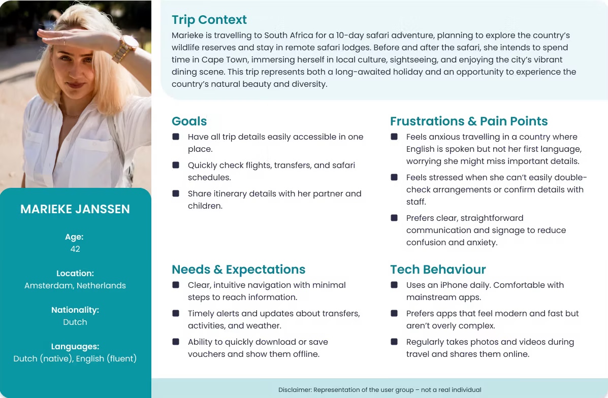
A representation of the user group, not a real individual.
The original flow maps how TravelKey’s screens connect, from entering a trip code and downloading an itinerary to finding daily plans and supporting information.
Open full-size task flow (opens in a new tab)
The messy part before the polished screens: working out the journey, grouping information and questioning the navigation.
Browse 3 photographs. Open any image at full size for the detail.
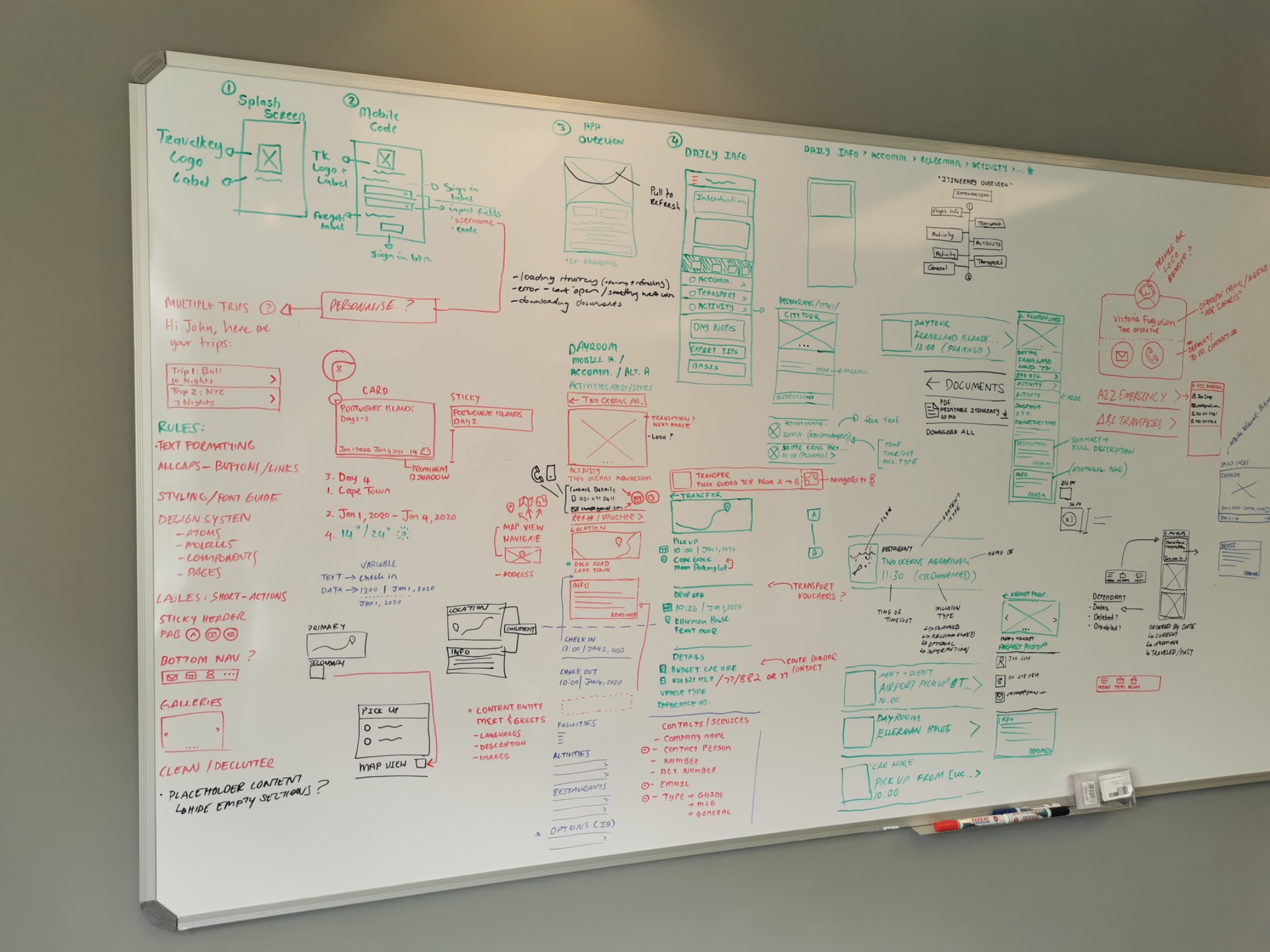
Early ideas for entry screens, daily plans, content grouping and navigation.
View full size: Mapping the experience (opens in a new tab)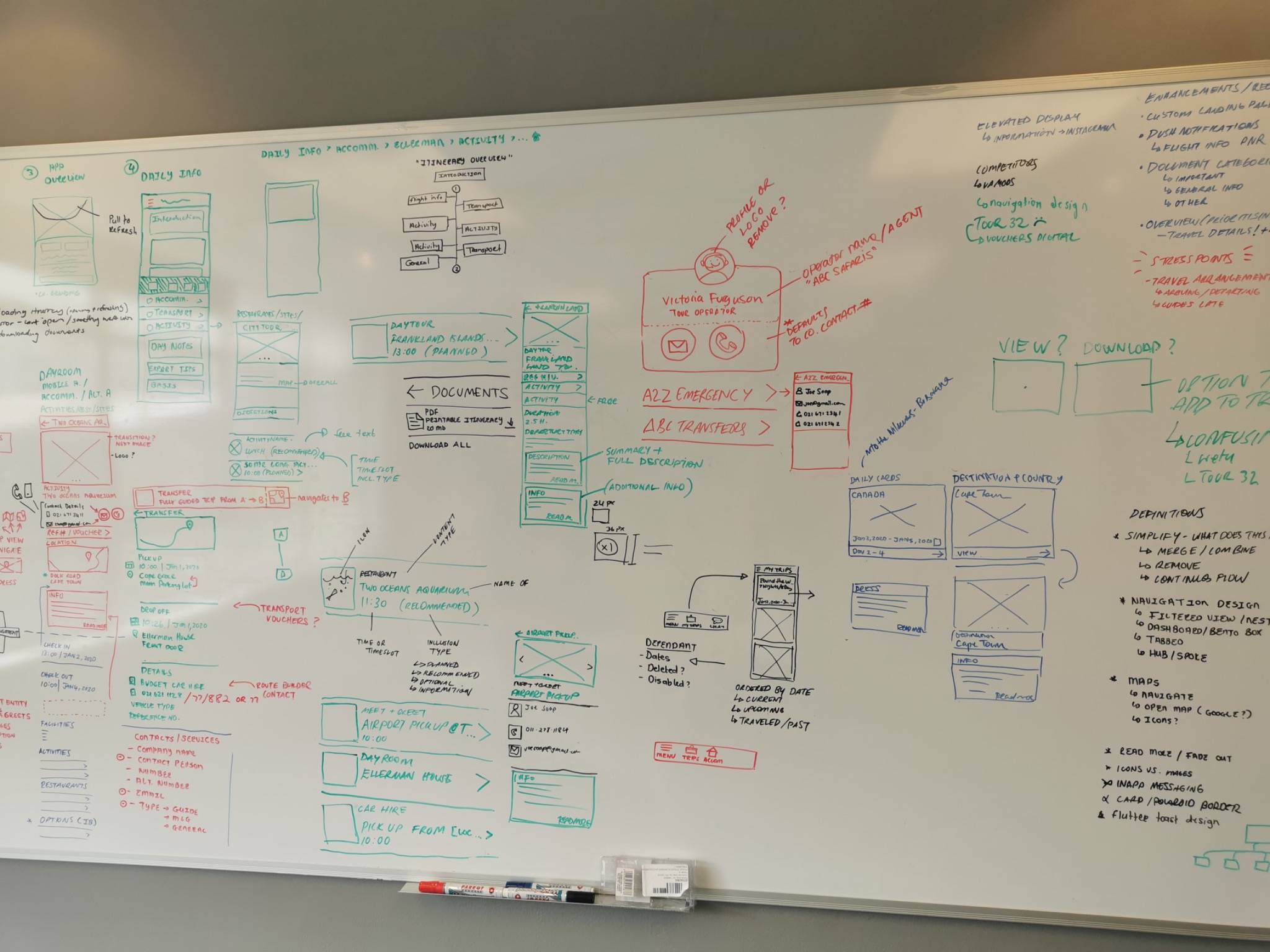
Exploring how documents, contacts, transfers and destination information fit together.
View full size: Connecting the details (opens in a new tab)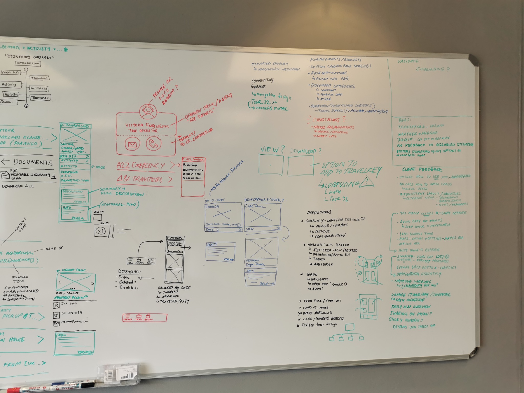
Notes on navigation, known bugs and client feedback alongside possible interface patterns.
View full size: Working through the questions (opens in a new tab)Early layouts exploring how travellers could download a trip, move between sections and find the details they needed.
Browse 6 screens. Open any screen at full size.
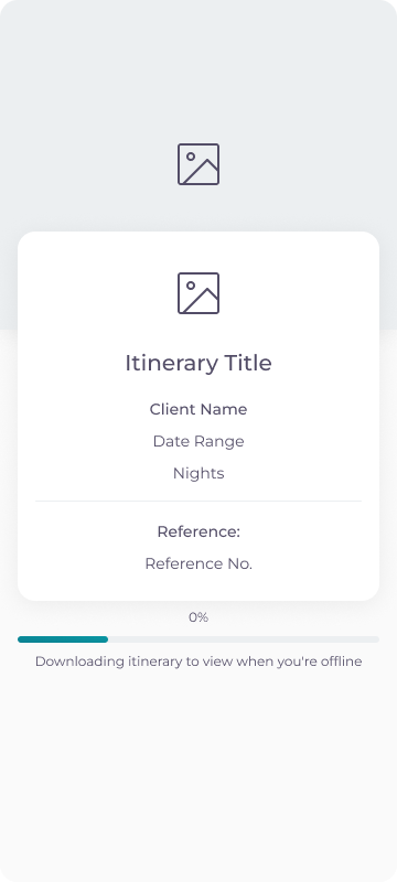
Trip identity and download progress before the itinerary is available offline.
View full size: Offline download (opens in a new tab)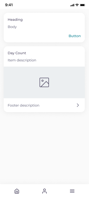
An early layout for daily content and the main navigation.
View full size: Trip overview (opens in a new tab)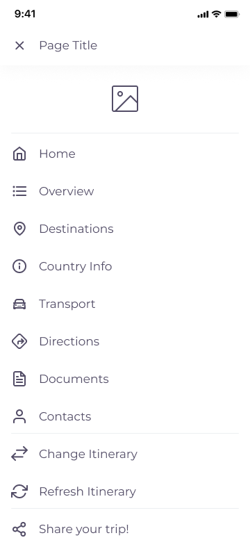
Visible routes to destinations, transport, documents and contacts.
View full size: Itinerary navigation (opens in a new tab)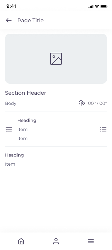
Exploring the hierarchy of imagery, weather and supporting information.
View full size: Detail structure (opens in a new tab)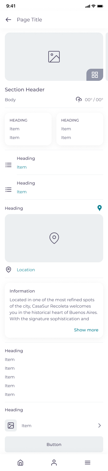
Grouping cards, practical information, location and longer descriptions.
View full size: Content-rich details (opens in a new tab)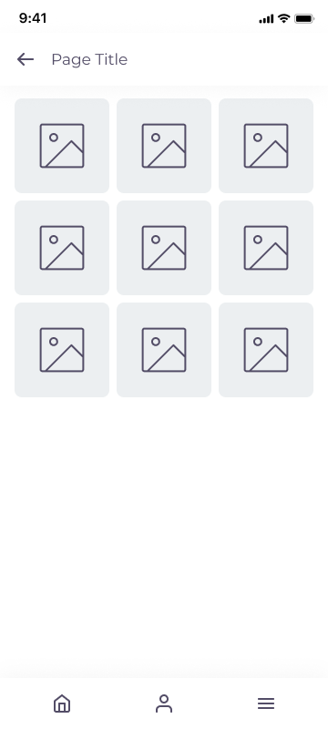
A simple grid for browsing the images attached to a trip.
View full size: Image gallery (opens in a new tab)The interface brought daily plans, accommodation, activities, directions and documents into a shared visual language. Explore the screens below, or open any design at its original size.
Browse 20 screens. Open any screen at full size.
A simple branded entry into the traveller experience.
View full size: Welcome to TravelKey (opens in a new tab)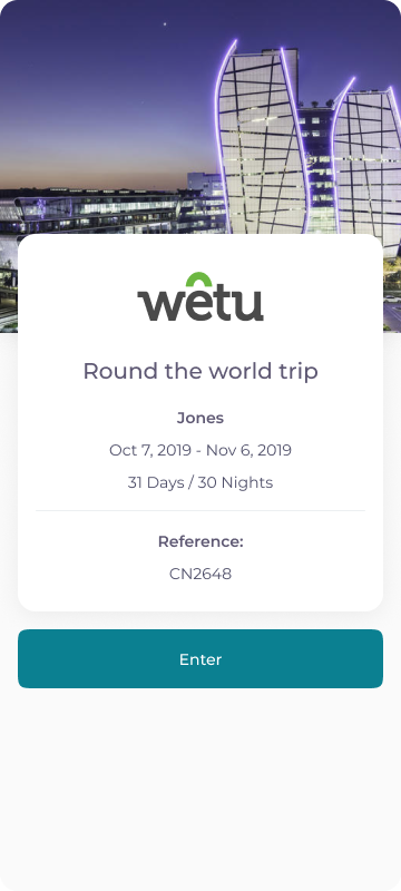
Trip dates, duration and reference details before entering the itinerary.
View full size: Trip introduction (opens in a new tab)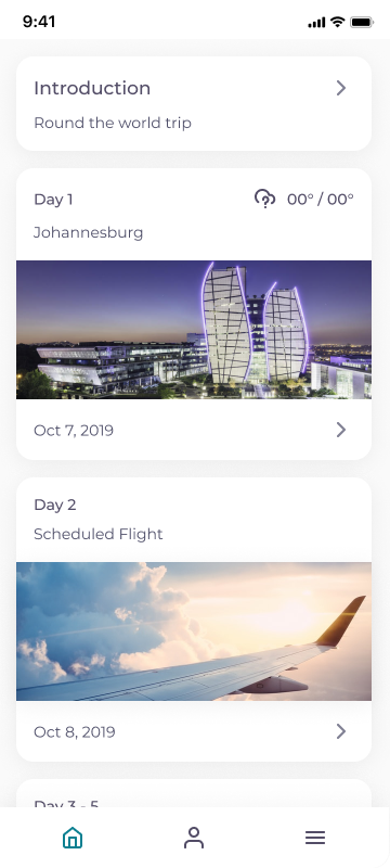
A visual overview of the journey, organised by day.
View full size: Daily overview (opens in a new tab)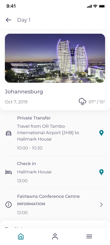
Accommodation, transfers and activities grouped into a daily plan.
View full size: Day itinerary (opens in a new tab)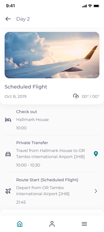
Check-out, transfer and flight details in one sequence.
View full size: Flight day (opens in a new tab)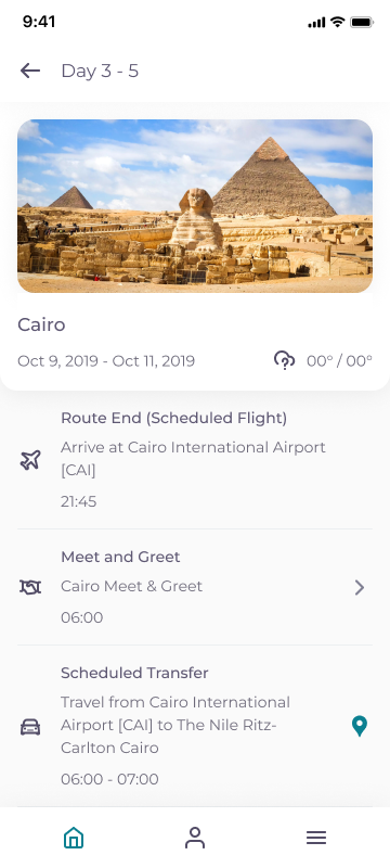
A destination view covering several days of the trip.
View full size: Multi-day stay (opens in a new tab)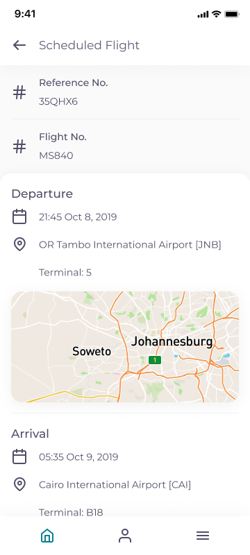
Reference numbers, departure and arrival information alongside a map.
View full size: Flight details (opens in a new tab)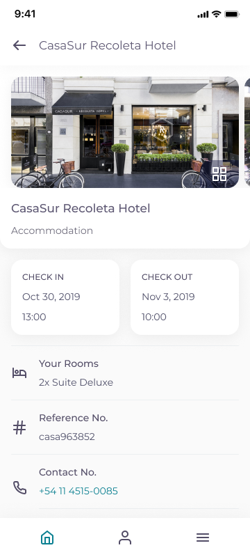
Check-in, check-out, room information and contact details.
View full size: Accommodation details (opens in a new tab)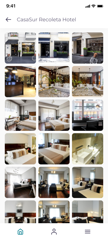
A grid for browsing the property’s images.
View full size: Accommodation gallery (opens in a new tab)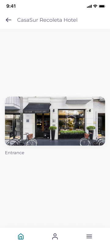
A focused view of a selected gallery image.
View full size: Image detail (opens in a new tab)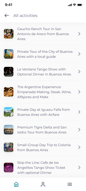
A scannable list of activities included in the trip.
View full size: Activity list (opens in a new tab)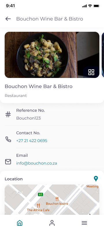
Booking reference, contact information and location.
View full size: Restaurant details (opens in a new tab)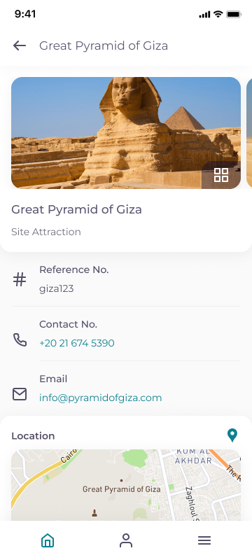
Practical information and a map for a planned visit.
View full size: Attraction details (opens in a new tab)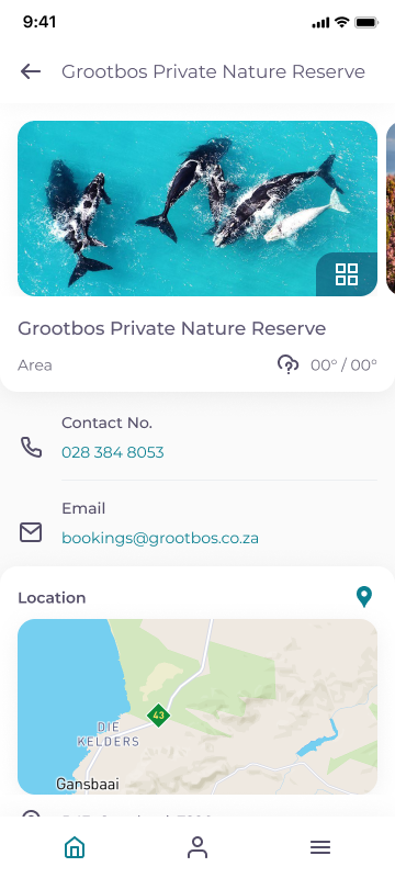
Contact information and location for a nature reserve.
View full size: Destination details (opens in a new tab)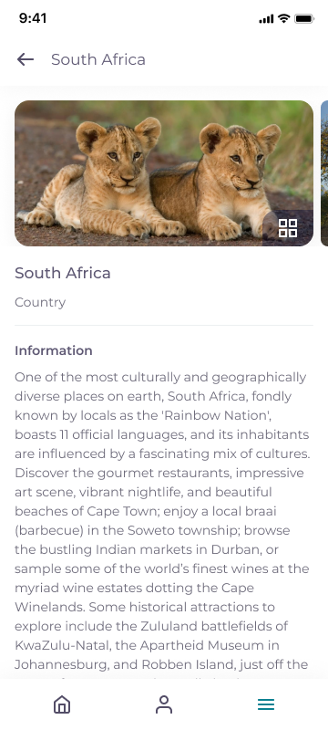
Longer destination content presented alongside imagery.
View full size: Country information (opens in a new tab)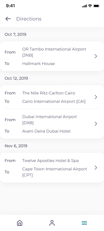
Routes grouped by date for easy reference.
View full size: Directions overview (opens in a new tab)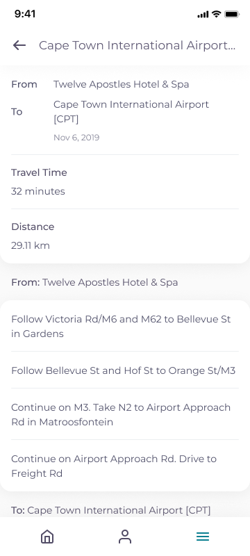
Travel time, distance and written directions for a transfer.
View full size: Route details (opens in a new tab)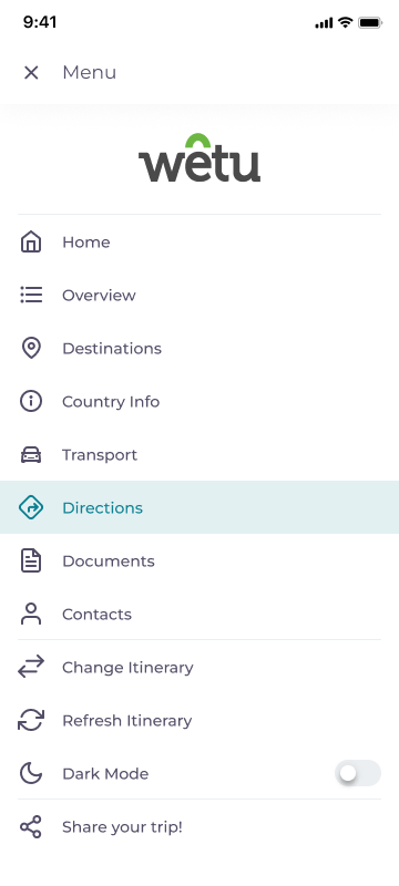
Shared navigation, itinerary actions and display settings.
View full size: App menu (opens in a new tab)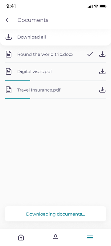
Document downloads and their availability in one place.
View full size: Travel documents (opens in a new tab)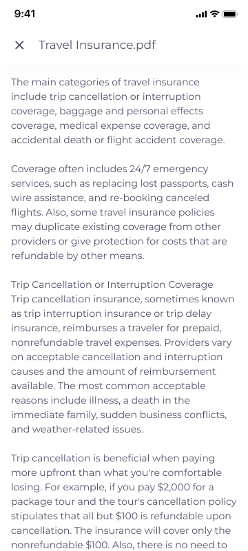
A focused reading view for a travel document.
View full size: Document reader (opens in a new tab)A recorded walkthrough reconstructed from the original TravelKey designs, showing how travellers move through their trip information.
2 min 15 sec
The redesign shipped with a shared experience across iOS and Android, offline access and dark mode. We also explored client theming, but it remained an ambition and did not ship during my time at Wetu.
A five-star Google Play review from December 2020, during my time at Wetu, described the value of giving guests a digital itinerary they could use throughout their trip.
“I use this app for work. It's great for guests to see their digital itinerary. It also means less paper to carry around whilst on holiday. Seamless use that clients really enjoy.”
Google Play figures checked on 2 October 2026. These reflect the app today, including development after my time at Wetu.
View TravelKey on Google Play (opens in a new tab)TravelKey taught me that reliability is part of the design. A traveller looking for a transfer time or voucher needs the answer quickly, whether they have signal or not. Clear labels and readable content mattered more than decoration.
Moving to Flutter also meant working through design and development constraints together. Shared component patterns gave us a foundation for a consistent experience across iOS and Android.