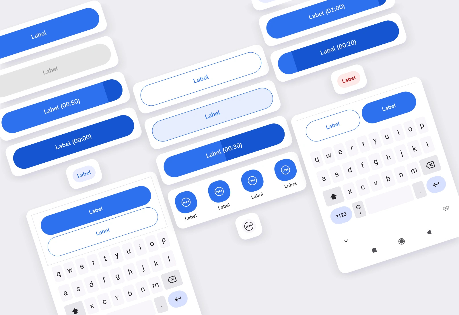
Actions
Primary, secondary and tonal buttons, tap and disabled states, timer variants, icon actions and sticky action layouts.
View full-size collection ↗Six curated views of the library, showing component variants and states. Each snapshot uses the original component artwork. Open the full-size view to explore the detail.
Primary, secondary and tonal buttons, tap and disabled states, timer variants, icon actions and sticky action layouts.
View full-size collection ↗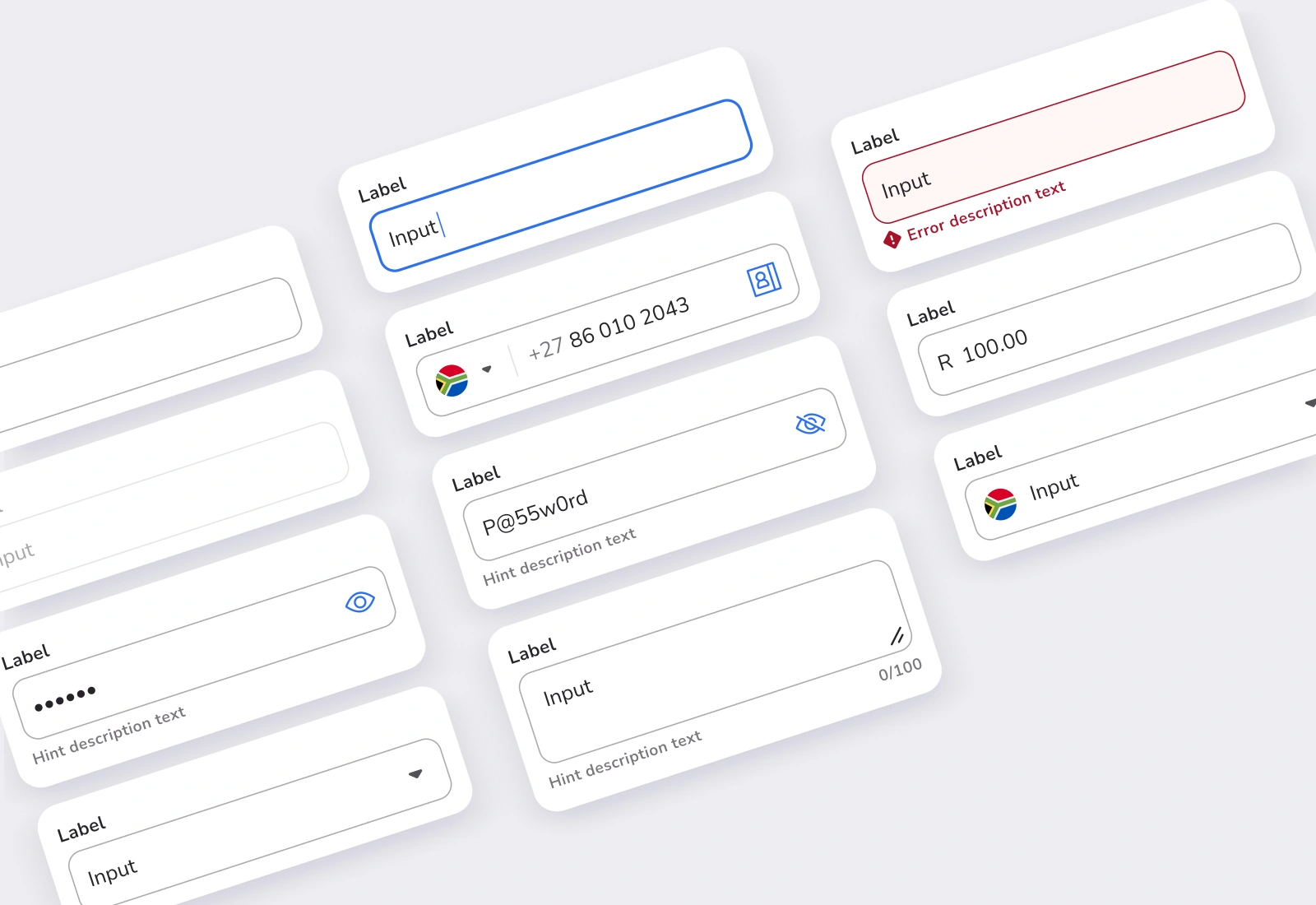
Text fields, password and currency inputs, country selection and text areas, including the supplied validation states.
View full-size collection ↗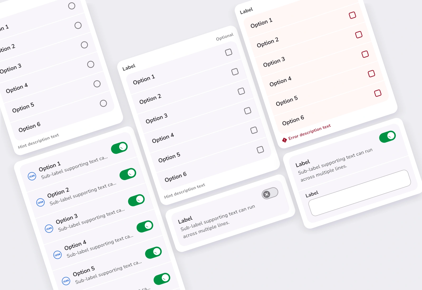
Radio and checkbox groups, switches and conditional input extensions.
View full-size collection ↗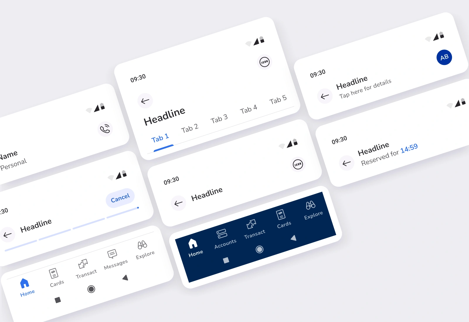
Dashboard, page, beneficiary, progress and signpost app bars, alongside retail and business bottom navigation.
View full-size collection ↗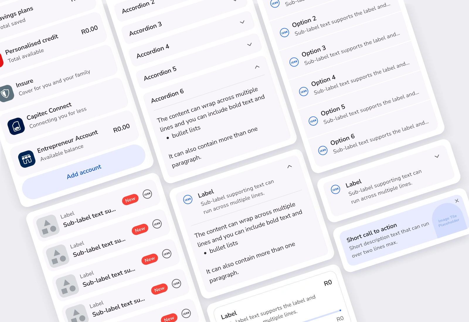
Account and rewards lists, interactive content, accordion variants, vouchers and promotional tiles.
View full-size collection ↗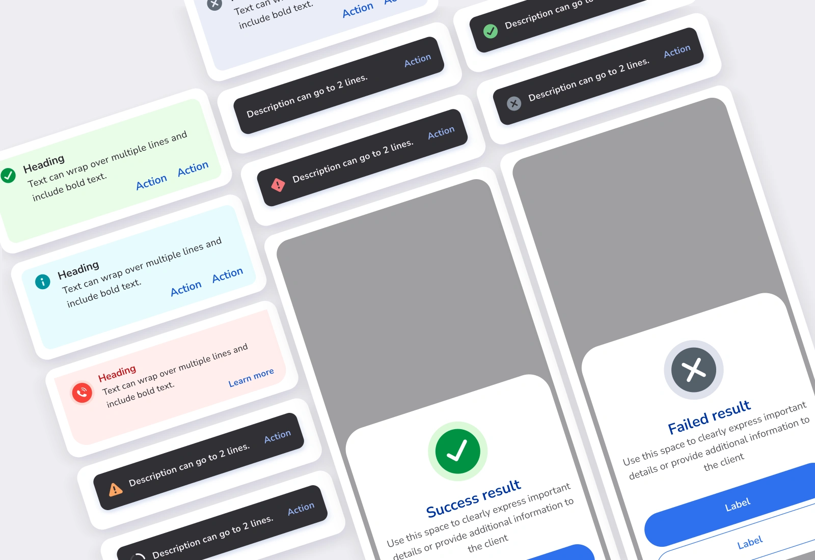
Alerts, call notices, snackbars and takeover dialogs, showing different levels of feedback.
View full-size collection ↗