Atomic components
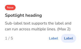
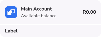
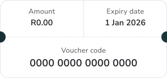
Reusable building blocks and their variants, designed around Material 3 patterns. Its familiar foundations help us make coherent decisions across the app, including for clients on different operating systems.
Making accessible, consistent design decisions easier to carry across a large banking app and the teams building it.
Design system figures from the September 2026 review. Bank-wide client figure from the 2026 financial results.
At the end of FY2026, the bank had 25.8 million active clients, including 15.3 million active app clients. The app is its largest channel. A component decision here travels a long way, so consistency needs to hold across journeys and teams.
I help lead the system used by 24 designers across retail banking, business banking and online banking. My work spans component decisions, documentation, governance, accessibility reviews, handover and quality checks. I also mentor designers as they use and contribute to the system.
Reusable building blocks and their variants, designed around Material 3 patterns. Its familiar foundations help us make coherent decisions across the app, including for clients on different operating systems.
Contrast, interaction and pattern decisions considered as part of the component work.
A Material 3-based type scale, with a separate, carefully adjusted scale for components still using the legacy Kendo framework.
Patterns that need to remain coherent and legible across both visual modes.
Paragon has a Material 3-based scaling formula. While we still have legacy components in the library, we also need to support Kendo’s percentage-based modes: Regular as the baseline, then Medium at 130%, Large at 170% and Extra Large at 200%.
Those percentages cannot simply be applied to every font size. A 56px heading would become 112px at Extra Large. I worked with a developer to map out a dampening curve: smaller text scales up, while the increase gradually tapers for larger display text. It gives us a workable bridge until the legacy components are removed.
| Baseline | Medium | Large | Extra Large |
|---|---|---|---|
| 16 | 21 | 28 | 32 |
| 32 | 40 | 45 | 47 |
| 56 | 56 | 56 | 56 |
The smaller token doubles at Extra Large. The 56px display token stays at its baseline size.
Paragon also includes specialist libraries built by other members of the team. The illustration and icon work gives designers shared assets to use across the product, while reviews help keep the wider system consistent.
My contribution sits alongside theirs: reviewing work together, connecting patterns across the libraries, and supporting handover and quality as the system grows.
I design and build many of Paragon’s components myself, and review every component contributed by other designers. I also help manage the backlog and allocate the team’s work, making sure decisions are documented and ready for development.
That work continues after handover. I check links and specifications with developers and business analysts, then work closely with QA to make sure the built components match the designs and meet our accessibility and consistency standards.
Each week, I meet with designers across the app team to review their flows, offer feedback and suggestions, and work through tricky decisions together. Supporting the people using the system is as much a part of my role as building the components.
Explore Paragon’s component families, visual foundations and library governance, then see the shared patterns working together in the LOTTO journey.
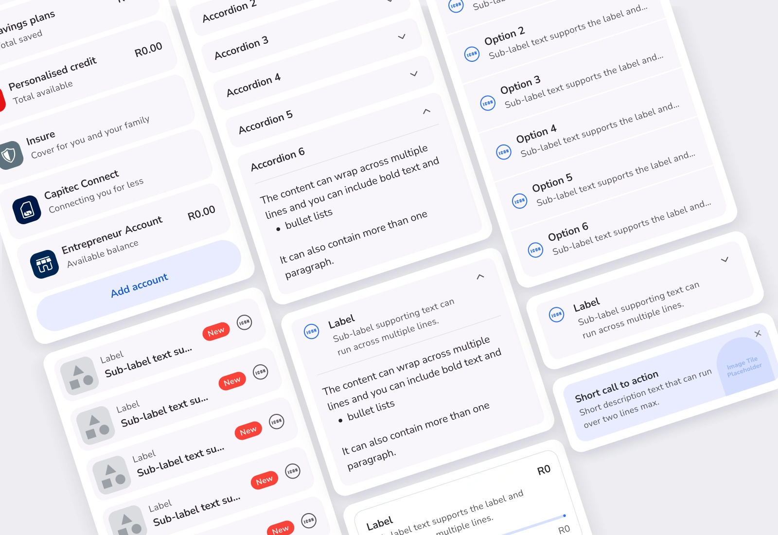
Six curated views of the Figma library, including actions, forms, selection, navigation, content and feedback.
Explore the collection ↗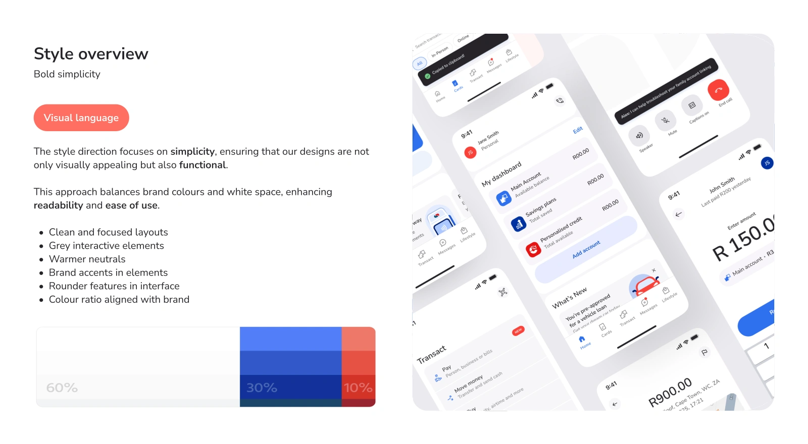
The visual language, typography and colour decisions that connect the component families.
Explore the collection ↗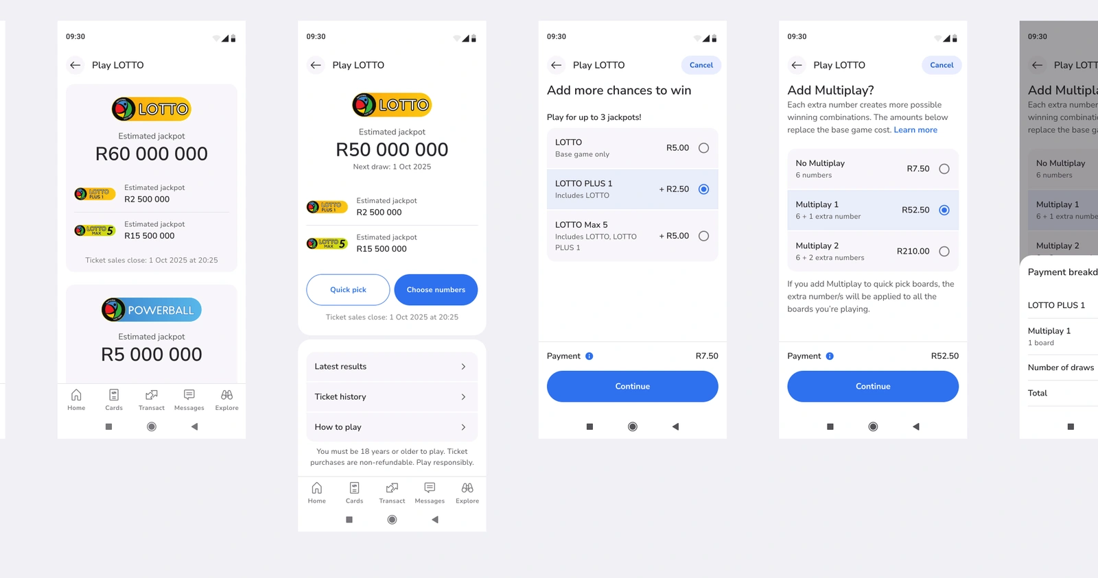
The LOTTO journey combines Paragon’s shared patterns with the new operator’s colours and logos, including the LOTTO balls.
Explore the LOTTO flow ↗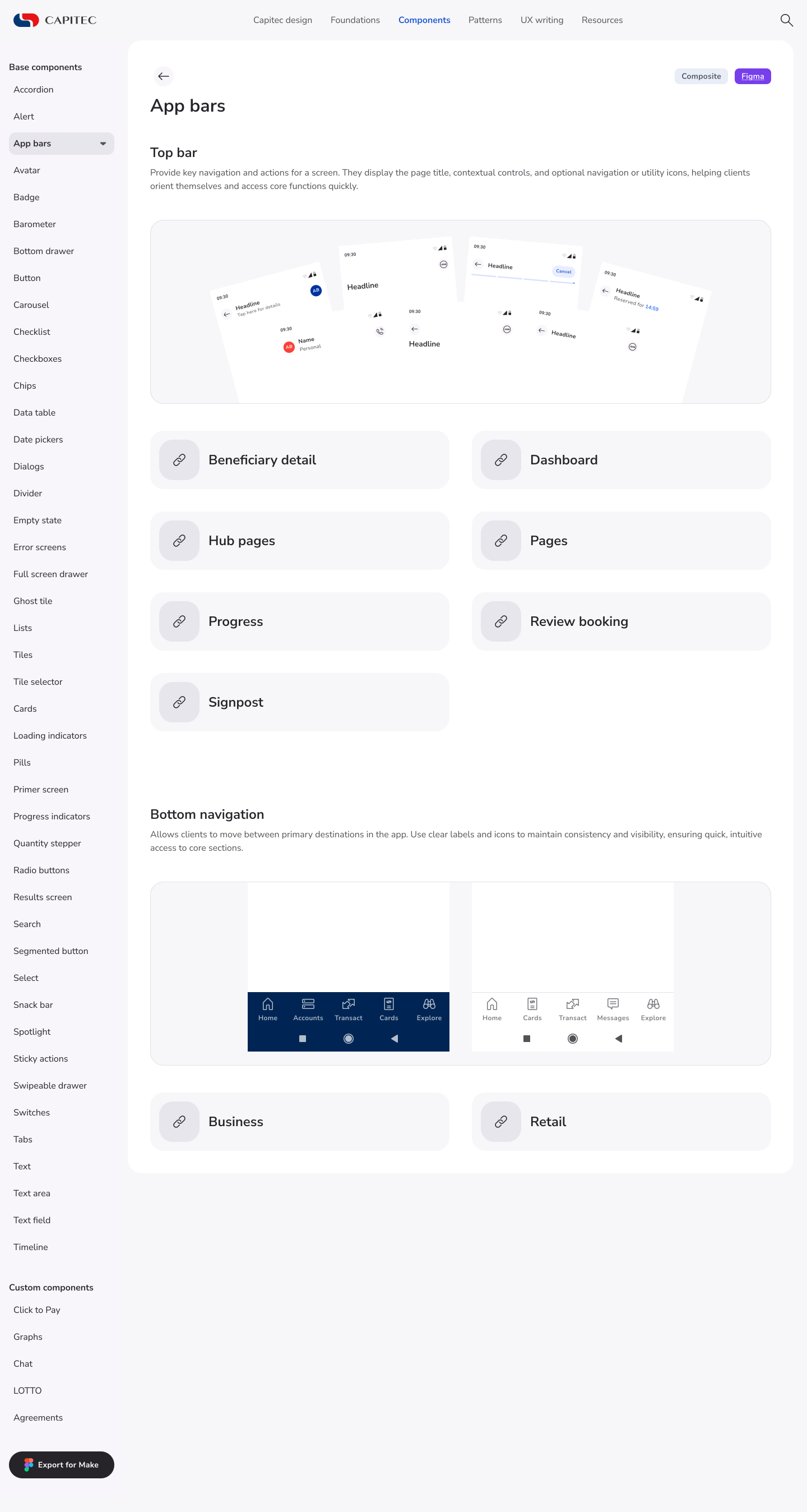

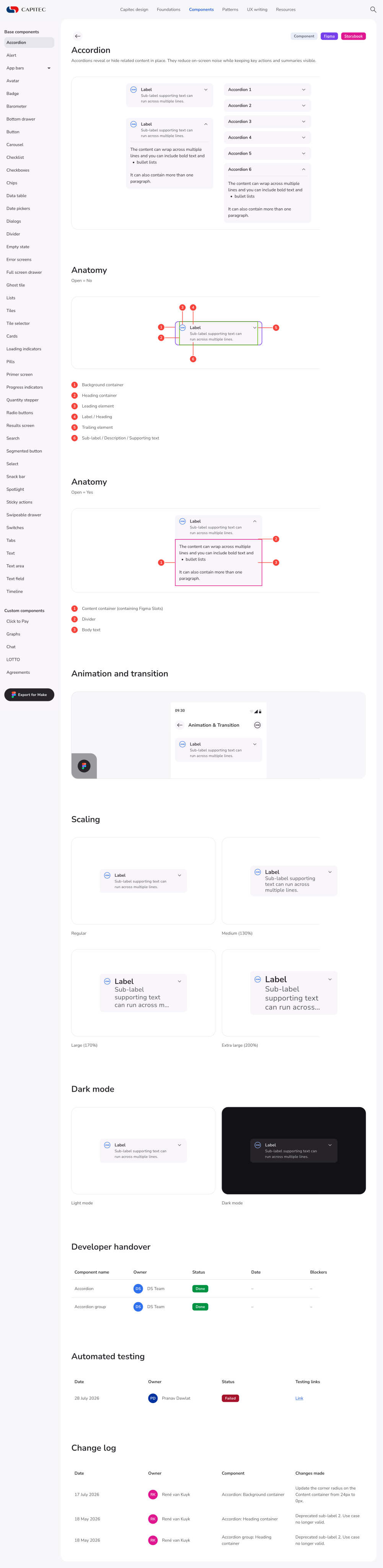
A collection of component documentation covering anatomy, behaviour, scaling, themes, developer handover, testing records and change history.
Explore the collection ↗I began the first iteration of Paragon in 2024, when the app team was still small. As the sole designer building the new component library, I was trying to anticipate the needs of the bank’s largest channel.
At first, I made a variant for just about everything a designer might need. Properties and variables were less mature, and I was still learning. Then my list items reached almost 3,000 variants. That was my fairly loud sign that working harder was not the answer.
I started working with the designer maintaining our existing library, despite boundaries that made collaboration difficult at first. She helped me understand how properties could do the work of hundreds of variants. The designer building Paragon’s web library later joined us.
When the app team and marketing merged in September 2025, we could collaborate openly within a shared structure. Our design system team grew to four people, supporting the wider team and scale reflected in Paragon today.
That changed how I build. I now ask what really needs a variant, what a property can handle, and whether the next person can understand and maintain it. Flexibility is useful. Thousands of combinations nobody wants to touch are less useful.
What began as a component library built by one designer has grown into a shared design system, shaped by a team who care deeply about every rounded corner, type style, colour choice and pixel.