Inside Paragon · Documentation
Library governance.
Selected component documentation showing how I connect the design itself with the guidance needed to use, maintain and build it. The collection includes anatomy, variants, component rules, scaling, light and dark themes, developer handover, testing records and change logs.
App bars
The component family and its navigation patterns.
View original full-size document ↗ (opens in a new tab)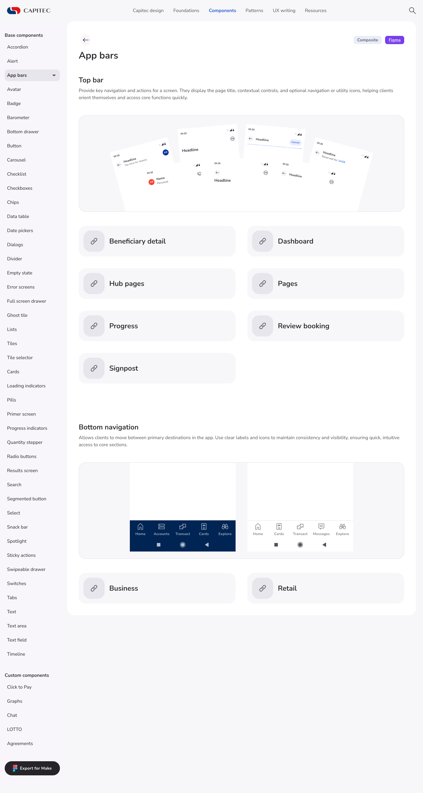
Top bar: Pages
Variants, anatomy, component rules, scaling, themes and handover.
View original full-size document ↗ (opens in a new tab)
Accordion
Collapsed and expanded anatomy, scaling, themes, testing records and change history.
View original full-size document ↗ (opens in a new tab)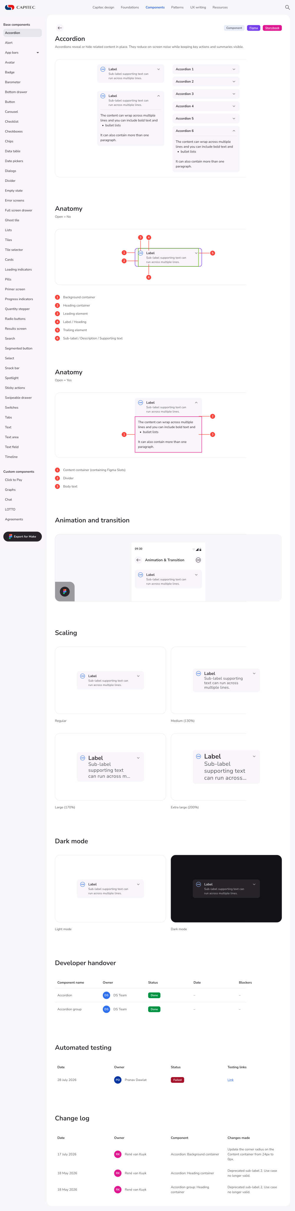
Scroll within each document to explore the detail. These are documentation snapshots. Displayed handover and testing statuses are records of that point in time.